If, like us, you are unfortunate enough to be working for most of the World Cup, you’ll want to download an app to keep you up to date with the latest team news and up to the minute scores. As you might imagine, there are several apps to choose from, so we thought we’d take a look to find the one that delivers – in terms of usefulness and, of course, usability.
We wanted a World Cup app to do 3 main things:
- Give a clear picture of which games are on when so we can make a plan for the must watch matches.
- Provide up to date team news on upcoming games.
- Deliver latest scores and player stats i.e., scorers and assists.
ITV 2010 FIFA World Cup App
Price – Free , Link to iTunes

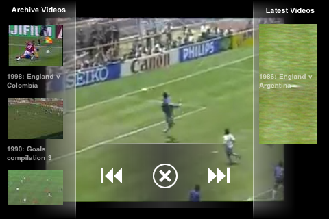
For keeping up to date with the latest news and scores, ITV’s iPhone app initially looks promising as it offers to show you all the goals for the World Cup, ideal if you can’t take the time off work, or your boss doesn’t believe you have contracted man flu (again).
However, after a play around we found a few usability issues. The app utilises a news ticker that is limited to showing two or three, often partial, words of a headline rendering it largely incomprehensible. The headlines for the feature boxes are also truncated. We found that the video used in this app isn’t formatted for the iPhone’s screen.
If you’re going to make an iPhone app then ensure you make use of the phone’s features, it also runs the same advert before and after a clip, hopefully it will have more varied advertising during the tournament.
Telegraph WorldCup
Price – Free, Link to iTunes

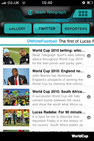
Moving on to another World Cup news app we found the Telegraph app benefited from some slick design where the front page of this app looks smart and gets straight to the point listing the upcoming matches. However, our problems started with reading the news, each headline is prefaced with “World Cup 2010:” leaving maybe one word and three or four letters of the next from the actual headline. It makes for an annoying guessing game, helped by the brief description of the story below the headline.
The photo gallery at the bottom of the app shows thumbnails of the latest images, click on one and you can browse them at full size. The whole app is well designed and laid out but fails to deliver when it comes to providing clear news headlines.
Sun Football World Cup Edition
Price £2.39, Link to iTunes

The Sun’s app is home to the paper’s full flood of World Cup news and events stories while also packing in a virtual interactive wall chart and one of those noisy vuvuzela horns that you’ll be hearing plenty of over the tournament. The app delivers news well with more headline space than rival apps, and with features like polls you do feel like you’re getting your money’s worth out of the application, even if the essential news is freely available elsewhere.
Mahango World Cup Schedule
Price – 59p, Link to iTunes

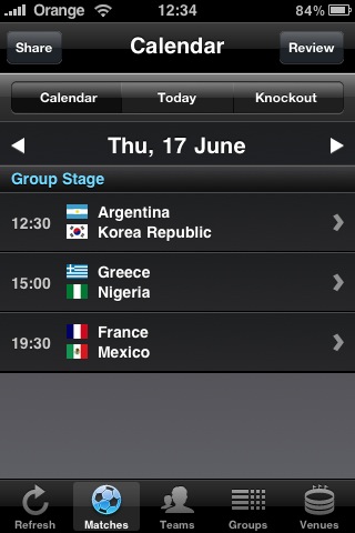
This app takes slightly odd approach to navigating the tournament where you have to choose a date from a calendar to show which matches are on that date. This makes a rather frustrating way to navigate. The alternative is to find teams by their federation. Both strange choices of interface design.
Unfortunately the unintuitive navigation, coupled with the fact that it doesn’t offer anything that the free applications cannot provide, and lacks the updated news, means that there’s nothing here to make you want to choose it over a free product.
South Africa 2010 Tracker
Price Free (59p for non-ad version), Link to iTunes

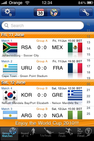
This app is probably the simplest in terms of design and navigation as it is purely designed to provide a view of which matches are being played, either by group or by date. Because all the matches are displayed in one scrolling list, it is easy to scroll down by date and see what the next matches to be played are, while also seeing the scores for previous games.
The app promises to update the scores and provide match summaries. Although the app lacks any real news capability, its simplicity means it offers something really useful and we see ourselves using it regularly during the tournament to stay updated and plan which matches to watch.
Conclusion
Unfortunately, none of the apps do everything we wanted in a clean, easy to use way. Based on our experiences with these apps we would recommend the Mubaloo South Africa 2010 Tracker to easily see which matches are on when and stay up to date with scores. In addition, we would suggest that the Sun’s application is the best to stay up to date with all other world cup content and news.
Most of the apps are still making some basic usability mistakes and it is clear that none of them have invested in usability testing which is disappointing. There were some simple usability issues that should have been spotted and fixed before these apps were released, the most common being trying to cram headlines into tiny spaces. Other quirks appear that also shouldn’t appear in professionally developed applications but as the World Cup is the first mega-event in the iPhone era (we think the 2008 Olympics was just a little early) hopefully they will learn for next time.
Have you found a good World Cup App we haven’t mentioned?

