A recent report from the Royal Mail reports that 82% of online shoppers said that free delivery would encourage their use of a website.
This makes sense, but before you rush out and start advertising ‘Free Delivery’ all over your website, it is important to look at how best to promote this.
When usability testing eCommerce websites we often observe users completely ignoring large ‘Free Delivery’ banner adverts, and still getting confused when they are looking for delivery information. This is due to banner blindness, where users discount anything that looks like an advert in the corner of their eye. So how do eRetailers combat this?
First, look at the user journeys to understand where in the process they will need information about free delivery. There are often multiple points in a process where your customer will ask themselves about delivery charges. This may differ on a variety of websites but typically this will include:
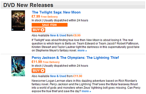
- Pricing – include ‘Free Delivery’ where ever you quote a price. This will remove the need for users to ask how much delivery will be
- Product detail page – explain that delivery is free when users are reading about a product and considering their purchase
- Delivery page – for users who are specifically looking for delivery information, ensure there is a dedicated page to reiterate that delivery is free

www.play.com provides ‘Free Delivery’ message with all pricing
The above tips will provide a starting point to encouraging your users to buy from you. However, observing your users interacting with your website continues to be the best way to establish where in the user journey the Free Delivery should be mentioned, and to establish what other barriers are a cause of cart abandonment for your users.
How well are you promoting Free Delivery, and do your users see it?

