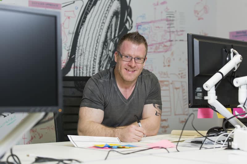
Our latest UX Insider Interview is with Paul Stevens, an Experience Design Lead at Auto Trader. It was fascinating to learn more about the UX process used to help car dealers utilise Auto Trader’s data to sell more cars.
Who are typical Auto Trader users and what’s your role at the company?
Auto Trader has a split of customers. We have our consumer side, the people who use our website to search for and advertise their car, and then we have the retailer side – these are car dealers who use our trade-only products to understand how best to price, advertise and sell quickly, helped by the huge amount of data and insight we have.
I’m responsible for the UX of the products that service the needs of our car dealers.
Can you tell us more about your users and how you cater for their needs?
Our types of user and size of business vary massively. Think of a guy who sells cars on his drive, maybe he sells three or four cars a month. Then there’s a typical local garage, with say 20 cars on its forecourt, or we can shoot right up the scale to the largest segment, a multi-site group or car supermarket that has thousands of cars in stock.
We’ve grown really quickly and we have some key products that have been built by Auto Trader. But we also have products that we’ve acquired over the last few years, which use or used completely different tech platforms. That means we’ve had to do a lot of work just to get the systems to be able to talk to each other.
The obvious issue with acquiring and bolting these products together is that the user experience doesn’t flow as well as it could do, which is where my team and I come in. For example, two years ago these products still had separate logins and now we have a single log in. It’s my responsibility to create a seamless experience that gives car dealers all the tools they need to be successful digital retailers.
What are the biggest challenges that you face in the next 12 months?
The main challenge has been integrating our products into one proposition, and developing that journey for the customer.
Another big challenge we have, but a good one, is data. Data is massive and we have huge amounts of data to help our customers. As an example, we can inform car dealers if that particular Ford Focus that they’re looking to buy and sell is popular in their area, if it’s likely to sell, what it will sell for and how quickly. This data is extremely powerful and can mean the difference between making a loss on a car and making a decent profit. When this is scaled out across large amounts of stock (cars) you get a sense of how important Auto Trader is to our customers.
Thinking about that data, and the people who use our products, we also have to provide for completely opposite ends of the spectrum. We’re trying show the guy who left school at 14, with 30+ years of experience in the industry, that we have data that can really help him.
We’re trying to help users like this understand that we’re not ignoring their years of experience, or telling them what they ‘should do’. It’s an amalgamation of both – a balancing act. We have all this data and they have all the years of knowledge. Let’s pull it together to create something awesome that could help them make more money.
We then have the opposite type of user, a marketing manager for a multi-site dealership who’s using multiple devices, iPad, iPhone etc, and can’t get enough data, the more the better. He loves everything in an API that he can use in his own systems as well.
That demonstrates the broad spectrum of users we work with, who range from really non-tech savvy to completely techie. The challenge is creating products that are right for all these users.
“It’s not a case of passing something into a UX team to sprinkle some UX magic dust on it. UX is at the core of our products.”
What’s your UX process?
In product and tech we follow the Spotify model of tribes and squads, cross-functional teams. Every squad is aligned to the business strategy. But every squad has their own roadmaps and are empowered to achieve their goals how they see fit. A typical squad consists of a product lead, tech lead, delivery lead, design lead, developers, data and marketing experts.
This approach contrasts massively to how design and product development traditionally work, where a brief would come from marketing, would go to a design team, and would be passed to a UX person, with a commercial person involved. Then you’d go off and test it and chuck it to another office where developers build it and then give it to you when it’s finished. More often than not, the finished product wouldn’t be right.
We just don’t work like that. Everyone here is passionate about doing what’s right for the customer and launching the best product. The UX role is ingrained in that team, it’s the team’s responsibility to own the UX, but they’ll also be great product and tech people who want the best user experience. It’s very much a team thing.
The great thing about Auto Trader is that everyone within the business is really focused on the users. It’s not a case of passing something into a UX team to sprinkle some UX magic dust on it. UX is at the core of our products.
We’ve had help along the way. Shortly before I started Marty Cagan came in to demonstrate how to create great products with minimal waste. Then under a year ago, Jeff Gothelf, Josh Seiden and Giff Constable came in for a week-long intensive workshop for the product and UX people in the business to further instil the lean UX approach.
“There is only so much you can get from a prototype without live data being shown.”
So how does the lean UX approach work in practice?
It’s key for me that we start with empathy, really learning to understand what our users need.
We come up with assumptions, develop these and turn them into a hypothesis – which we’ll then test. We do this by speaking to customers – car dealers, in my case. It may just be a case of phoning them and testing the proposition with them before we’ve even drawn anything, so we know whether the idea is worthy of pursuing.
We test the hypothesis, then we story map their potential user journeys and work up and test sketches. We’ll move quickly to wireframes and follow that process. We’re trying to set up a quicker design process. Historically, wireframes to a build can be a tedious process. So we’re creating a living style guide from sketch files to live code all in one place. This will allow us to move much more quickly. By using our design patterns from this style guide we will be able to jump into live spikes pretty quickly to test with users. There is only so much you can get from a prototype without live data being shown.
We can get consumers in every day as we have a testing lab, led by our customer researcher. We can pay a consumer £50 to come in for an hour and take part in testing. The problem with our car dealers is that they’re really busy – it’d take more than £50 for them to come and speak to us, as it essentially means taking half a day to come into Manchester City centre.
How do you conduct research with your users if they’re too busy?
Nine times out of ten we’ll go and see them, which is a bit of a challenge as we have to negotiate a time, taxis, where they’re located, etc. But the insight that you receive by meeting them in their own environment is worth it. They’re much more comfortable than coming and sitting in an unfamiliar room. Our office is very welcoming and our testing suite is really nice, but they feel like they’re being tested, even when we tell them they’re not.
Typically they’re more relaxed when we go to them. We’ll go with a testing plan, and structure it as we think a conversation would take place, but it’s not a script. We try to keep it as informal as possible. We always go in pairs: one to test and one to take notes. We’ll do a lot of qualitative testing. It’s all very well showing them fake ‘situations’ with fake cars, fake adverts – but we’re just testing the assumptions and the general premise of what we’re trying to say. As I said earlier, if the initial signs are positive, we will then look at spiking a live data prototype and repeating the process.
We have many different reactions to being asked to be involved with testing products from customers. Some say they are not really interested and will see it when it’s finished, but others say that they’re really passionate about the industry and want to help develop a product that meets their needs. We learn a huge amount from this testing, and one good thing is that our customer type (car dealers) are not backwards in coming forwards – if something doesn’t work for them they will tell us in no uncertain terms, which is exactly what you need.
You mentioned that you can’t really pay them £50 to come in for an hour, so how do you incentivise them to get involved?
It’s really because of their long-standing relationship with Auto Trader. They have been with Auto Trader long before it was online, when it was just a printed magazine. This is a product that they pay a lot of money for and that affects their daily lives. They can’t run their businesses without it – it’s very important to them; therefore they want to help.
What type of UX research do you do?
Really the whole company gets involved with research – we have a huge customer centre and sales team that are always feeding back ideas and improvements directly from our customers.
We also track drop outs within journeys and click data, along with having good old fashioned conversations directly with our users.
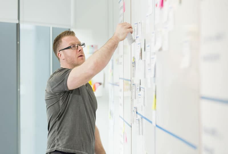
We do qualitative tests first with dummy data, so we have some solid foundations to build on. We will then spike out a live prototype, if positive we then release an MVP to a percentage of users to get more live feedback. As we get more confident with our build we increase the number of people with access to it.
Outside of myself, Auto Trader runs huge ethnographic studies of consumers and dealers – so we have both sides of the scale. We normally have big ethnographic research happening, how it affects people’s daily lives, the future and the present and their emotions and feelings. Then in ‘the trenches’ we have the really quick usability testing – opportunities for quick learning and understanding as we go.
What are you working on at the moment?
We have a product out at the moment in test, which we’ve put to 100 dealers who signed up to help us. We don’t want to put this onto the market yet because we know it’s not 100%, but we know it has value to our users and we’re continuing to iterate on this from their feedback.
What would you say was the biggest UX mistake you’ve made in your career and what did you learn from it?
This would probably have been in my junior days of UX. I was not vocal enough. In more traditional silo companies, the designers are lower down in the food chain so can get overruled a lot. I was running UX testing on a company’s product feature, we’d recruited users who met the demographic exactly, and it had completely bombed – but the product director claimed we had used the wrong type of users, and still insisted that the product go live – when it then, again, bombed.
You should always be able to back up decisions with insight but the funny thing here is we had all the insight but it was still pushed live.
“Failing is a good thing, but fail fast, fail cheap and learn from it.”
What’s the most valuable thing you’ve learned during your time at Auto Trader?
The most valuable thing I’ve learned is the importance of working well with others. Ask questions – don’t be afraid of asking stupid questions. It’s my job to find the answers, and when you don’t know them straight away, the only thing you can do is ask questions and find out. If we can spend a day on an idea, with a few calls and a few sketches and find that something is broken and doesn’t work, then it hasn’t cost us anything. If we build an idea, code it up, put it live and it hasn’t worked, it’s cost us a lot of money, a lot of time and we just can’t get that back. Failing is a good thing, but fail fast, fail cheap and learn from it.
What would you say is the most useful tool or method you use to get your job done?
In terms of UX processes, it’s all about understanding what affects customers as quickly as possible, looking at personas (but not in the traditional sense). We look at lean personas, so we strip out a lot of the fluff that usually pads out personas and we focus on the elements of their lives that affect their usage of our products. For example, knowing John is married with three kids and he’s got a dog doesn’t really help when creating a car valuation tool, but knowing he’s a technophobe and only works three days pricing cars does.
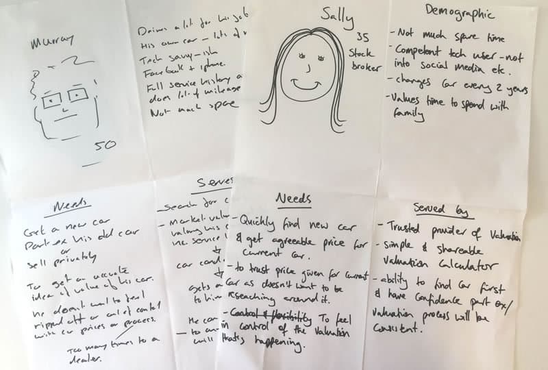
We’ll spend an hour max on these rough personas, just to get an understanding of what the user need is.
Once we have quick personas, then a really good process is story mapping. We’ll map out the journey and the wants and needs of what a consumer requires from this product. We’ll help use that to decide what our first MVP could be and decide what we are going to build first based on that. We’ll go and test that first to see if it works.
“With digital it moves so fast that every day you’re learning something and hopefully you’re better than you were the day before.”
How did you get into UX in the first place?
I started off as a graphic designer, pre-web really. I was working with print and printers, which led me to financial services and all kinds of annoying direct mail. You can thank me for that! There was a huge amount of A/B and multi variant testing going on in direct mail, which I found really interesting. I started working more and more on the digital side and this eventually led me to the comparison site MoneySupermarket. I was there for seven years or so. That was where my UX education really started, and it was thanks to people I worked with there, and now the people I work with here, who are developing me and my experience as I go on.
As a designer, observing someone actually trying to use your design, trying to do something with it, is a light bulb moment! Getting involved with customer testing was when I decided that this is what I wanted to do.
With digital it moves so fast that every day you’re learning something and hopefully you’re better than you were the day before.
We can’t know everything in this digital space. Is there any area of knowledge you feel you need to know a bit more about?
Yes, everything really! You can never get enough experience. I just want to continue to get more and more knowledge.
In your UX team, do you do everything internally or do you outsource at all?
It’s all done internally. I have three designers who report to me, who cover UI and UX. We have frontend developers who are also very well skilled in UX. We have brilliant people here; product owners, delivery and tech leads, QA, developers and data people – these can all add value to user experience.
Like I mentioned earlier, Auto Trader runs huge ethnographic studies of consumers and dealers – so we have both sides of the scale – and we’ll use outside help for this when needed.
“What I like about user experience is that no matter where you do it or who you work for, you’re affecting people’s lives or you’re trying to make their lives better”
What would you say is the best part of your role?
What I like about user experience is that no matter where you do it or who you work for, you’re affecting people’s lives or you’re trying to make their lives better. Thousands of people a day will interact with something that you’ve done to help them. This is why I’m passionate about user experience, knowing that I’ve affected someone, hopefully, in a positive way.
What would you say is the hardest part of your job?
Sometimes you’ll doubt yourself about a decision you’re making and it’s important to get the insight to appease those doubts. I’d say the hardest part to me is being totally happy with what you’re doing and what you’re designing, because there comes a point when you can worry too much. You can worry about the tiniest things instead of getting out there and getting it tested.
Where do you go for inspiration? Do you have any favourite sites, blogs or books?
Yes – Twitter is the tool I use most for inspiration. It’s just brilliant, lots of great people to follow and lots of sound bites to learn from. I prefer small sound bites that I can remember rather than trying to read a big, lengthy document. Conferences are good, as well as meet ups – Manchester’s got a really strong design culture.
A friend did give me a really, really good book a while ago – it’s called ‘The Science of Shopping’. It’s just a phenomenal book. I read that many years ago and I thought ‘whoa’. I’d encourage any UX person to read that book, just to get a slightly different angle.
Are there any websites that you look at and think: ‘wow, they’ve totally nailed it’?
No. I’d say that there are no websites where I think: ‘Yes that’s completely nailed it, that’s smashed it out of the park’. Lots of websites I think are really, really good but they also, for me, need to tie into a great product – satisfying a need someone has.
What do you think might be different in five years in the way that we buy and sell cars?
In 2010, the average number of visits to the garage, a forecourt, was 4.4 times before someone bought a car. In 2014 it dropped to 2.2, halving almost every four years. From our data and the DVLA’s data, this shows that people are making more and more decisions by researching online – and just turning up to collect their keys from the dealership. That’s a challenge for the motor industry, as it doesn’t fit in with their traditional way of selling, and the amount of chances they have to interact with a customer and do their salesman bit is dropping fast.
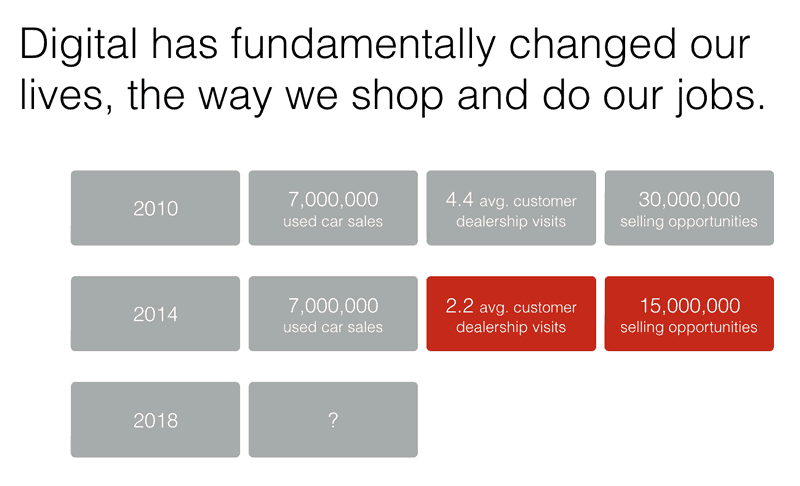
When people buy cars, it’s becoming more and more online and less and less about the dealership that they go to. A massive part of what we’re looking at on Auto Trader is allowing customers to review a dealership that they’ve visited, whether they’ve bought a car from them or not. So if you’re thinking of buying a car from John’s garage down the road, you can quickly tell if John’s garage is decent or not. It’s definitely the way it’s going, researching online and turning up to collect the keys.
“It’s fine to not understand things. It’s not your job to have all the answers; it’s your job to help get those answers. “
What advice would you give to somebody starting a similar role to yours in a similar company?
I would say to just really go for it. I mean, never be afraid to ask what seem like stupid questions. It’s fine to not understand things. It’s not your job to have all the answers; it’s your job to help get those answers.
You’re going to make mistakes, but make them as quickly as possible, and if something doesn’t work, just cut it loose. Don’t get emotionally tied to anything. It’s hard not to if you’re passionate about a project and have spent a lot of time on it – but there are times when something’s not working and you just have to cut it loose and move onto the next thing. This is why the lean way of working is so good – you don’t get time to get stuck on anything because it’s all tested so fast.
————
Thanks for reading. If you would like to be interviewed, or you’d like us to interview anyone in particular please get in touch.
You can find Paul on Twitter: @ChunkyUX, or check out more in our UX Insider series
