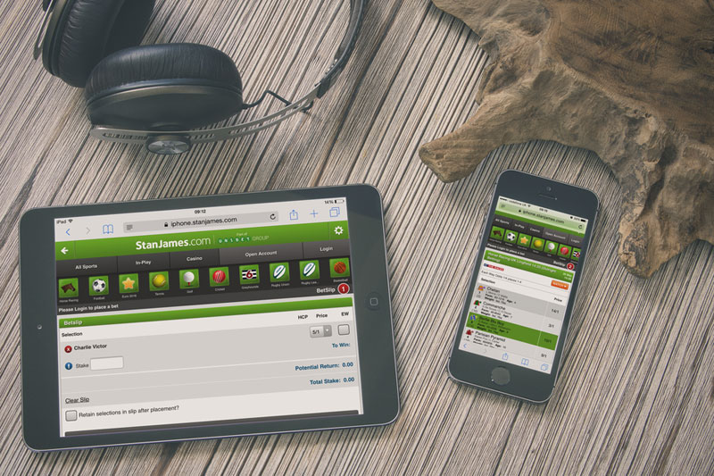
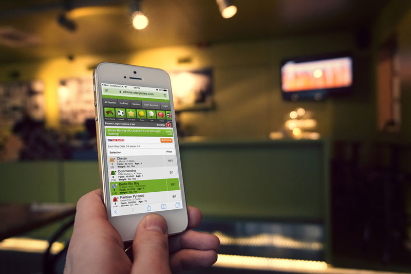
Stan James is one of the leading online betting and gaming sites in the UK. Ali Carmichael talked to Stephen Wade, Sportsbook Product Development Manager at Stan James, about how our multi-platform usability testing helped them to increase conversation and exceed their target by 100%.

What was the situation at StanJames.com prior to this project?
Here at StanJames.com we found ourselves in a great position of having a truly well recognised horse racing betting brand in the UK market, arguably the biggest and most important market in Western Europe. Back in the late 90’s to early 00’s StanJames.com was at the forefront of online sports betting and practically invented “in-play” betting and things were looking good.
Moving on to the last few years our market share in the UK was fairly stagnant and our competitors were gaining grounds in new areas; the UK market is the most competitive and fastest paced in our field and losing ground in this market is almost fatal to a business in this industry.
Whilst we were still seeing decent numbers of new registrations, we weren’t seeing the expected number of first deposits along with that and had to do something.
“Our aim was to increase the number of first registration conversions through to deposit by 1.5%, a small but achievable number and if successful would translate to a huge improvement month-on-month.”
Why did you think you needed usability testing? What were you hoping to achieve?
As we were looking to improve this initial “first registration through to deposit” journey, we had started to run internal testing. Whilst this was giving us some good insight, it was not a true reflection of what new users would experience, being that most internal ‘testers’ were quite accustomed to our website and it’s intricacies. We needed an external, unbiased and fresh set of eyes to go through the journey and point out all sticking points, areas for improvements and so on. Our aim was to increase the number of first registration conversions through to deposit by 1.5%, a small but achievable number and if successful would translate to a huge improvement month-on-month.

Why did you select Experience UX? How did the project go?
I was looking for companies in the UK that could conduct user journey testing, and having done some research online I read through some of the case studies on the Experience UX website and was quite impressed with the variety of different company websites that they had worked with.
The project went rather well. As it was a new sector for Experience UX, having never worked with an online betting company website previously, I was rather impressed with the professionalism and flexibility that they showed. From recruitment of specific test users meeting our criteria for gender, age, previous betting experience etc., to creating the journey’s themselves – I was quite happy throughout the process.
I was able to be present throughout the testing, being able to see new users’ reactions was hugely insightful and important in order to gain a better understanding of the journey, as well as making small amendments to the tests where necessary.
Once the project was complete we received a full overview of the test subjects, the videos of the tests and importantly the report of prioritised recommendations from Experience UX that highlighted the areas in need of improvement.
What was the outcome? Any surprises?
In the detailed report that we received from Experience UX we saw that there were around forty areas for improvement, which was more than expected and showed just how blinkered or biased we were, however objective we were trying to be previously.
“As you may know there are always projects in the works and so we needed to prioritise the recommendations in order to make the best use of the results within the constraints of development time that we had.”
What did you do next / how did you utilise the recommendations?
Initially I gathered all stakeholders (department heads of products involved) and took them through the results that we received. Once done we went through each point individually and rated them in terms of priority, importance and achievability. As you may know there are always projects in the works and so we needed to prioritise the recommendations in order to make the best use of the results within the constraints of development time that we had.
Whilst we couldn’t achieve all of the recommended changes, we were able to complete all of those that we had highlighted as the most important.
“Month-on-month we are seeing results of close to 3%, which is a huge boost overall and this trend is continuing.”
The picture today – results?
When we briefed Experience UX we were converting at about 1.5% and aiming to hit 2%. Having implemented the changes that were recommended from the usability test, we monitored the results and it didn’t take long to see the improvements. Month-on-month we are seeing results of close to 3%, which is a huge boost overall and this trend is continuing.
A lot has changed in the last 2 years, both in our industry and in our own company and we are in a great position to move forward and challenge our rivals.
Improvements to user experience are always necessary and something that should never cease. After conducting this testing we can easily see, looking back, that we were stagnating and not giving these areas (first registration, deposit journeys) enough value or the importance that they truly do merit.
It was an eye opening experience, and a great pleasure to work with such a talented, passionate and professional team at Experience UX.
————
Thanks for reading. If you would like to talk to us about this project and the methods we executed please contact us.

