HomeLet specialises in insurance products for tenants and landlords in the private rented sector. Ali Carmichael talked to Matthew Carter, Digital Marketing Manager at HomeLet, about how our UX design process filled a gap in usability knowledge, helping to exceed targeted KPIs for their website and quote process.

“Experience UX brought a wealth of knowledge and methodology to the project and provided the ‘user-first’ focus that we needed”
What was your driver to work with an external UX team?
We’re currently growing our insurance business through more direct channels. Tenants and landlords are becoming firmly established direct-to-consumer markets and the competition in the market has increased, so there is a growing onus on the performance of the website.
Naturally, over time, key stats can start to decline; this can be driven by many factors including user expectation and changes in technology. Some of the core metrics for the quote processes had declined and we wanted to invest in an approach that would drive real change in user experience.
We like to keep our customers at the heart of what we do, that’s why I was interested in user-centred design. I wanted to present a viable business case to improve the online buying process for both tenants and landlords, which included feedback from our customers during development.
As a team, we could have looked at the product and kicked off a project ourselves, but we had a gap in terms of user experience and usability, both from a technical and a design perspective. It can be a struggle trying to articulate design through development, so we needed an external UX team who could help us to define significant milestones of the project and manage key actions.
Experience UX brought a wealth of knowledge and methodology to the project and provided the ‘user-first’ focus that we wanted. As specialists in user experience design, and being independent from the HomeLet brand, their guidance through the audit, the workshops, the wireframes, the physical design and then the test of the design, helped to drive the project along efficiently.
“The workshop was a key part of getting buy-in from important stakeholders in different areas of the business”
Which UX methodologies were used throughout the project?
The foot in the door – to get the process underway – was an initial UX audit. From that, we discovered some clear areas for improvement. This opened up the opportunity to get a more detailed analysis of our website, and the market, from a user perspective.
The next step was capturing user requirements and talking to our target audience. Getting this evidence provided the necessary credibility when we presented the business case to our investors.
Oli Gitsham (Experience UX) facilitated several workshops here in Lincoln, the first of which covered user profiling. At HomeLet, we’ve been supporting our market for almost 25 years, and we have some strong relationships with landlords and tenants.
The profiling workshop helped us to really define our target audience, based on the various goals users have when they come to our website, giving us a strong understanding of who we were building the site for.
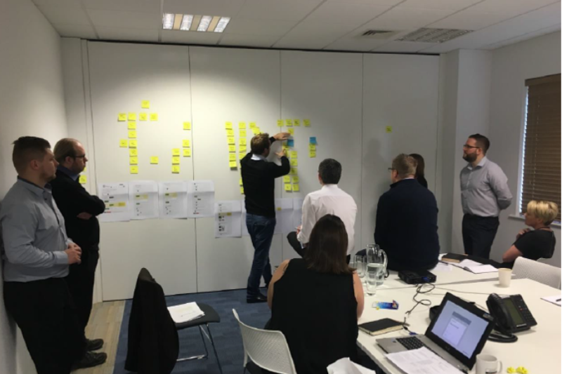
The second workshop helped us refine the questions we were asking, and to understand the business requirements for every field in the quote form process. By involving people from across the business, the workshop was a key part of getting buy-in from important stakeholders, and to answer any questions and concerns at an early stage.
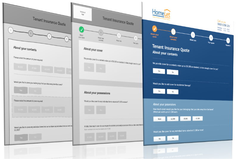
We then worked with Experience UX to map out the quote process journey afresh and put it into a wireframe prototype. Having an external third party mediate is incredibly valuable.
After the workshop, Experience UX created a prototype that looked like a fully-working front-end website and could be tested with users. It’s exciting when you see everything finally come together into a functional, working design.
“The usability test of the fully designed prototype helped instil the confidence that our changes worked.”
Workshop with project team to refine the quote form
Were there any internal challenges during the UX project?
When you’re developing something as complex as an insurance quote, you have a lots of moving parts. It’s often difficult to articulate requirements – but the IT and Change teams at HomeLet did a fantastic job implementing a process which mirrored the business’ expectation.
In addition, because we hadn’t significantly changed the quote process for a long time, the business naturally had some concerns with some of the proposed changes; including moving the user’s contact details to a later stage of the quote process.
However, testing the fully designed prototype with users, and seeing the user groups go through the original quotation and then through the newly designed element, helped instil the confidence that our changes would have a really positive impact on users. It added to the credibility of the entire project and any concerns internally.
“…securing the investment was relatively straightforward because the process we had gone through meant we could present it in a very logical way”
Looking back, what was the advantage of investing in a user-centred design process?
The UX process definitely expedited the entire delivery of the project and it helped that our investors and internal stakeholders knew that the project was in capable hands and that we had external expertise supporting the delivery.
Within most business there’s a high demand for IT resource and lots of different business priorities, but securing the investment was relatively straightforward because the process we had gone through meant we could present it in a very logical way and back it up with evidence.
The delivery of the design prototype really helped to bridge the gap between our expectations of the finalised designs and what was being built. Having the prototype as a point of reference ensured the project moved along smoothly and meant the business could approve the content and design in situ.
What we’ve often found is that you can reach the final stages, where the business can physically see the output, and then people naturally start to raise questions or come up with new ideas. This time, we could use approval of the design prototype as a milestone in the project to capture this feedback.
“Online conversion rate has improved by about 50%. When you’ve got a high volume of quotes coming through, it makes a huge amount of difference commercially”
Now the project is live, what has been the impact?
The feedback from all over the business has been very positive. The primary driver of that is the commercial results. For tenants, since the launch, insurance sales online are up on last year by almost 200%.
The key improvement in performance has been the conversion rate. The online conversion rate, for the tenant side of the business, has improved by about 50%. When you’ve got a high volume of quotes coming through, it makes a huge amount of difference commercially.
We use an independent peer-to-peer review system and the feedback on web inceptions has been very positive. The performance of the website is helping to support growth in our insurance strategy.
Factors like pricing and product features will always be important to our customers, but the usability-led design has added even more credibility to our insurance offering and helped to drive revenue growth. Part of that is how we present our up-sell, which was definitely a key focus of the new design.
Having brand new features such as the edit functions on the summary page was great as it meant people could tailor elements of their cover whilst they were at the latter stages of their quote.
Rather than just online data capture, we’re now getting more qualified leads. Email and telephone contact programmes have also been warmed up by the change in process. We’re finding the people we’re talking to are more engaged with the brand than they were in the past.
Having these metrics and confidence in the conversion rates has really helped bolster the case for investment in a broad range of acquisition activities. The appetite for investment to push relevant users to the quote process on the website has grown.
“By taking the perspective of the user, you’re actually indirectly answering all the commercial questions”

Low fidelity (left) to high fidelity (right) prototypes
What are the biggest learning points you’ll take away from the project?
The importance of considering the user at every point. This made a massive impact on the delivery and the success of the project. At HomeLet we have an ethos of putting the customer first – the approach with Experience UX helped us to embed that philosophy into this project.
By taking the perspective of the user, you’re actually indirectly answering all the commercial questions. We can see that in the outcome because the focus on usability has driven the right commercial metrics.
If I were to start the project again, I’d consider having a stronger focus on mobile usability. We had the mobile guidelines and everything was built so it could be stacked, but running actual tests on mobile devices as well as desktop devices would have been really useful for getting feedback on the common issues that mobile users encounter.
Overall, the impact on the business has been hugely positive. Focussing on UX has helped build a brand that not only consumers can trust and buy into, but our own internal staff can too.
————
Thanks for reading. If you would like to talk to us about this project and the methods we executed please get in touch.


