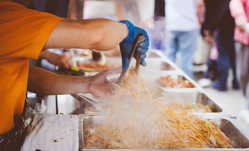
Recently, Experience UX held an ‘Innovation Day’; to step back and look at something in a different way, from different perspectives.
We wanted to tackle an issue that we were all passionate about, then implement UX thinking and process to improve it. Between the team we discussed 15 issues that we wanted to see improved, ranging from ways to alert the council about dog fouling, to trying saving the bee population. We chose to address the combined issue of homeless people going hungry and the increase in food waste across the UK.
Government statistics show that in 2015, 3,569 people slept rough on any one night across England, and that we throw away around 7 million tonnes of food and drink from our homes every year that could be eaten. Our aim, therefore, was to see how perfectly good food, that would otherwise go to waste, could be redistributed to feed homeless people.
 We focused on how to re-allocate food waste
So now that we had selected the topic for the day, we began by using a great resource by IDEO; The Field Guide to Human-Centered Design. This free toolkit is packed with processes and methods aimed at increasing your understanding of the people you are designing for. The toolkit guides you though the journey from the early brainstorming sessions right through to the end concept.
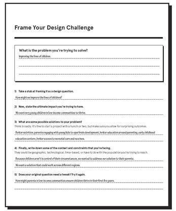
Our initial thinking focused on the large amount of food waste that is created by restaurants and supermarkets. Our perception was that most of these places are throwing food out that they can no longer sell, but is still perfectly edible. The aim was to get these places to donate the food rather than waste it. Even at this early stage, we knew giant supermarkets would be hard to convince, especially compared to a local restaurant owner. At this point we knew that we didn’t know enough to move forward with our idea, so we did some research. This unveiled that, in fact, a number of the large supermarkets are in fact donating food to charities like the Trussell Trust and Food Share. We still felt that the idea had scope, so took to looking at a few of the early stage methods from the IDEO toolkit, which would help to shape and focus our ideas. The ‘Frame Your Design Challenge’ resource was the first one we looked at.
We used this resource to go through the process of defining the problem, framing it as a question, listing possible solutions and examining the contexts and constraints of the issue. The next stage was to re-examine the first question. We did this process a few times, which evolved the idea considerably. We went from the issue being homelessness, to people going hungry, to people wasting food. The project rapidly grew and changed, but was becoming more focused into something we could actually influence and that could actually work.
We wanted a way for people to easily donate food
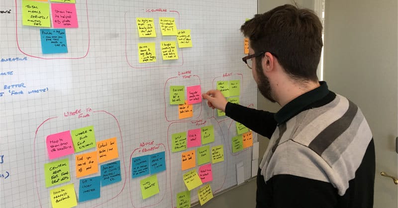
But there was the big question of : ‘how do you convince people to donate food?’ Well, the same way you get them to order shoes, listen to music and watch pug videos: with an app. We referred back to the IDEO toolkit and looked at using the ‘Finding Themes’ from the toolkit.
To work out what the themes and functions needed to be for this app we took to the Post-its and had a quick 5-minute brainstorming session of all of our ideas. Once we had all of our ideas together we talked through each one, combined any duplicate ideas and discussed ideas to understand how this would fit with the users’ goals. The final list of requirements for the app were:
- To advise and educate users as to why their donations are important
- What users can and can’t donate
- A map to locate local soup kitchens and facilitate collections in your area
- Have a social aspect to show how many other people are doing it
- Provide information on where the food is going and who the food has helped
- Some way of tracking a user’s donations over a period of time
We designed the concept around the donate user psychology
At this point we wanted to understand who would be using this app, how they would use it and how this app was going to get the food to the people that needed it. We decided to use the ‘Create Frameworks’ resource from the IDEO toolkit. We took to the whiteboard and began mapping out the user journeys, focusing on two core scenarios and examining the user psychology.
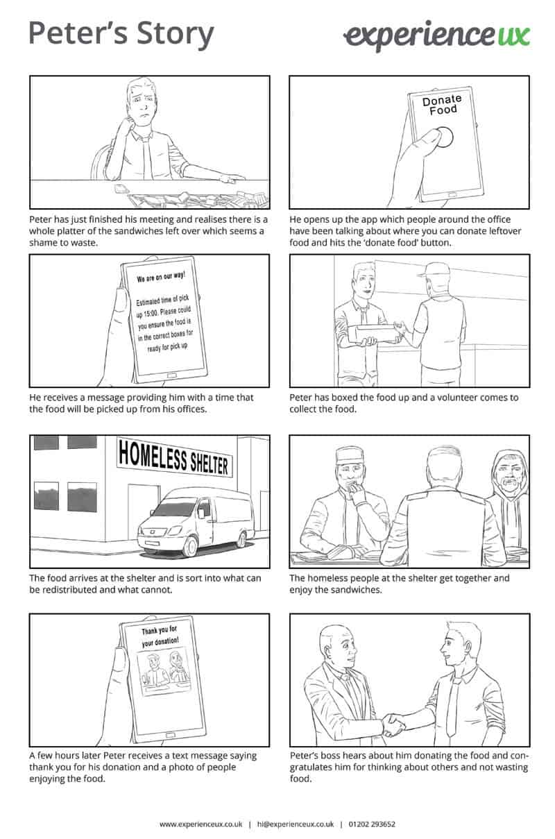
The first scenario was aimed at an office worker who, after over-ordering lunch, decides to use the ‘donate food’ app so not to waste the leftover platters. By going through this journey we were able to answer questions about the user and how the app might work for them. We assumed that because this user was working, they would not be able to leave work to deliver the food, but instead would need it collected. We even thought this scenario could be a daily occurrence as most big offices have meetings happening throughout the day and a collection could be arranged at a certain time to collect all the food from those offices. While mapping out this journey we continually kept asking the question of what would make someone do this, as we all know how easy it is to throw food in the bin. This was where we thought businesses could promote the food donation service and reward employees as well as the actual app providing information of who had received the food.
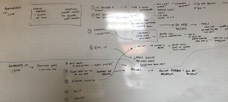
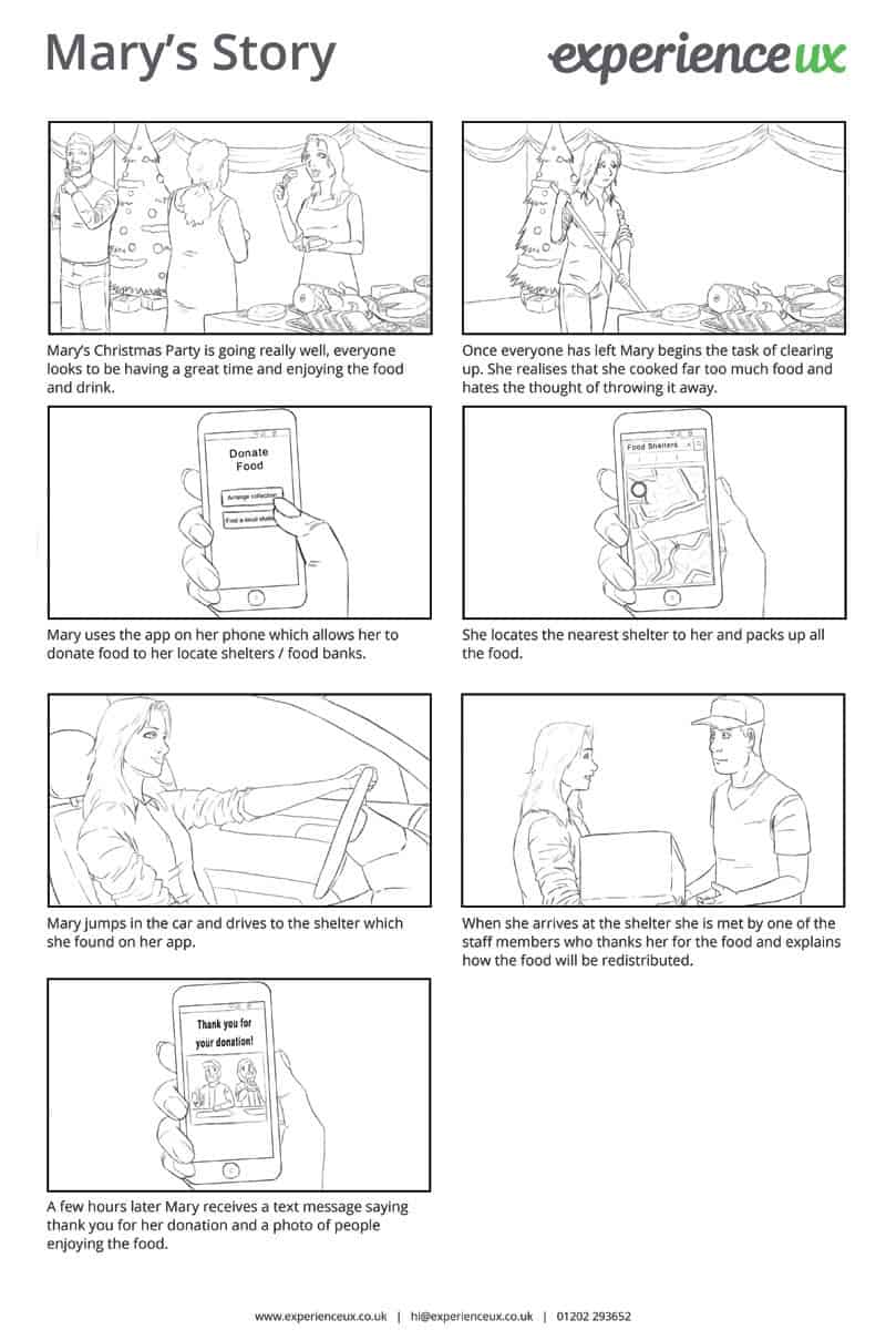
Our second scenario was focused on users at home. Perhaps someone had overcooked for a Christmas party, birthday party, or BBQ. We felt this user was more likely to drop off the food themselves, unless inebriated! But again, there was the question of how to get this person to donate the food rather than throwing it away. For this scenario we felt social media was key to promote the good work they would be doing and show that many people are donating in their local area. There was also the recognition that they have done something amazing, and would present a thank you with a photo of those who had received the food.
We began to wonder if we were thinking too big, as a collection system where volunteers had to make pickups from around town was short-sighted. When we put ourselves in the shoes of these users we came to the conclusion that for this app to work, it would require a huge number of people to suddenly become part-time delivery drivers. Which would be nigh on impossible to initiate and even harder to sustain.
After speaking to some food shelters we refined our thinking
But our spirits were not yet broken, so we went back to the research and looked into the local food banks and shelters. We called a local shelter to see if they could help us to answer some of our questions. We needed to know what they would and wouldn’t accept (a can of soup is evidently OK, but an untouched sandwich platter is not as obvious). We also needed to know how they receive current donations, and how many local shelters were out there in the area. The lady we spoke to was really helpful and told us that they accept anything, then internally divide up what they can and can’t give out; a big win for us which kept the concept alive. They receive the majority of their donations from volunteers, another win. But the total number of shelters in our area was shockingly low. This meant the catchment zone for each shelter would be huge. A volunteer would have to travel vast distances to collect and deliver food.
This research then forced the concept to adapt and change. We simplified the app to be centred around users taking their own surplus food to local shelters and kitchens; the Robin Hood approach. Now we didn’t have to worry about volunteer drivers. If this app was being used in a dense urban area the donators wouldn’t have as far to travel to drop off the food. We came to the conclusion that this system would be very hard to sustain in smaller towns and villages where there is only a handful of shelters.
It was getting late in the day; but we really wanted this work to actually be of some use. We decided that our work should be available to anyone who wants to take this challenge onto the next step.
We documented our concept with storyboards
The last step we took from the IDEO toolkit was to produce a storyboard. This was a quick, simple way to prototype the concept of our app and to demonstrate how it worked. An hour later we had our two scenarios written up as storyboards – these were then mocked up by a professional; and here they are:
Now we need your help
So that was our Innovation Day. But what’s the next step for this app? We really want to see this idea evolve and become part of people’s everyday lives, as we feel that it could help a lot of people.
However, we feel that we have got this concept to a point where it would need some further thought and knowledge that we don’t have. We have discussed crowd-funding sites and are fairly confident that it would pull in enough donations to fund the development of the app – but logistically we don’t have the knowledge of how to put this in place in different towns and cities. So, this post is a bid for someone to freely take on this project from the point we have got it to. Or failing that, help us move it forward. If you’re interested, please don’t hesitate to get in contact with us.
Let’s help the hungry with UX!
