Recently I read a really interesting article on how airlines are looking to other industries like retail, automotive, and hospitality in an attempt to improve the passenger experience. About time too!
Looking at other industries is good practice
It’s a common approach in business to look sideways at other industry best practices to generate ideas for improvement. Rather than just look at the quote form for an insurance provider for example, we would commonly also look at airlines, ticket booking sites, and hotel booking sites to see how they deal with the quote and buy process. We find that this approach typically sparks great ideas, which would have been missed if we had only looked at direct competitors.
So when I visited a few florist websites recently I realised that they hold interesting lessons that any retailer can benefit from. So why flower retailers? Because they face some interesting challenges:
- Users often have a very immediate need
- They shop almost entirely visually
- Delivery availability for a specific date is critical
- In most situations customers will never see the item they are purchasing in the flesh
- The delivery experience is a key part of the process
When you consider the context of the online flower buying experience, it makes for a fascinating source of inspiration.
1. Use your homepage to emphasise trust and credibility
Florist websites know that their users have a specific and immediate need that they can satisfy at any one of several competitors. They have to capture interest and communicate trust and credibility very quickly. To do this, the florist sites we reviewed utilised an area on the homepage, typically in a right hand column, to emphasise credibility, trust, and reasons to choose their site.
If your site operates in a competitive market, the following examples should help you to see how to use an area on your site to help users understand why they should stick around. The homepage or a landing page is the best place to utilise this content, however it could also be useful to have a similar message displayed throughout the site to retain customers.
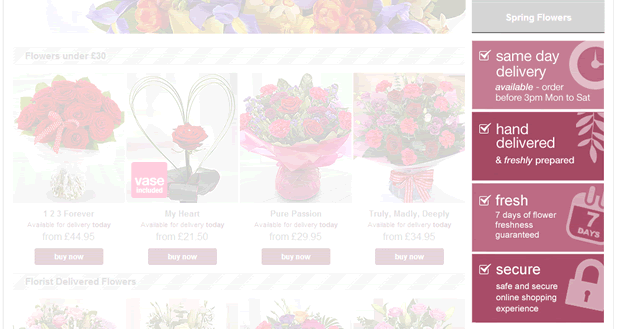
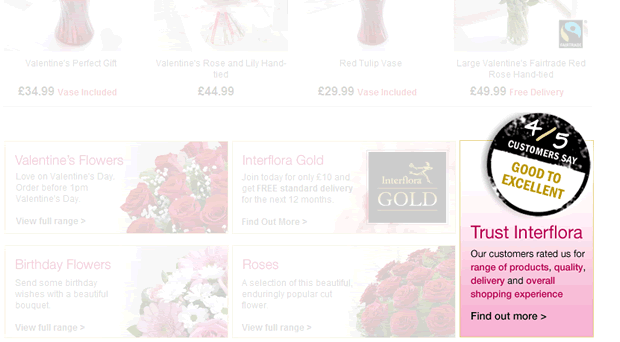
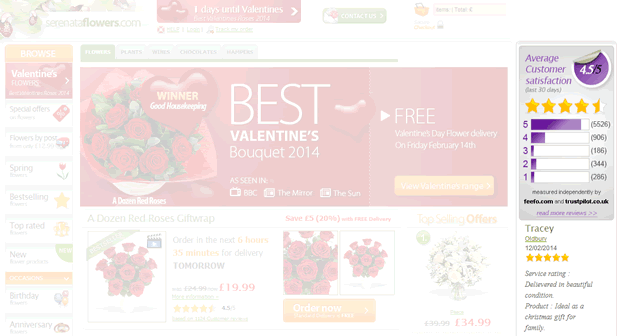
The common elements flower retailers are using here to establish trust and credibility are:
- The number of positive ratings they have been given – social proof that they are credible and have had a lot of satisfied customers using the site. This helps to confirm to users that the site is worth paying attention to and persevering with.
- Actual customer reviews – further social proof that the products and service are of good quality
- The number of products sold – demonstrating that the site is a credible retailer who have served a high number of customers, as opposed to a smaller site who are less established and in the customers mind a potentially higher risk
- Emphasise the personal process – terms like ‘hand tied’, ‘individually wrapped’, and ‘hand delivered’ help to reassure potential customers that the site offers a quality service suitable for their loved ones.
2. Provide assistance for customers to narrow their focus quickly
Online florists know that a large portion of their users are likely to be men who don’t know what to buy. To accommodate this, they offer simple ways to help them to narrow their focus quickly to either the occasion they are buying for, or by price.
Online florists do this by offering some useful tools to help users quickly decide a product category that suits their needs. These ideas are easily transferable to other industries.
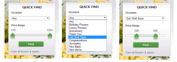
Next provide a useful tool on their homepage to allow them to very quickly narrow their selection by occasion and price. Online florists know that these two factors are the most common criteria users will have. So rather than making them dig around the product pages, they provide a quick navigation tool to narrow their focus to specific products that will suit them best.
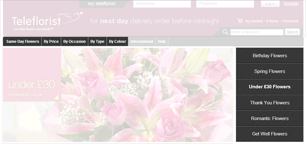
Teleflorist offer users a series of navigation choices to help customers narrow their choice by occasion or price. The ‘under £30 flowers’ option is likely to appeal to the large majority of men whose main criteria is budget.
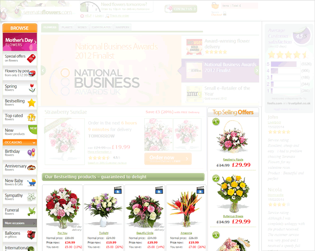
Serenata capitalises on customers not having a specific product in mind by showcasing best-selling products on the homepage. Should users not be inspired by these, the left navigation offers an array of other choices to narrow down to specific product areas.
3. Increase average basket value by clear upselling
Flower retailers understand their customers are typically making a one off purchase and they may never see that customer again. The customer goal in most cases is to have a positive effect on someone they care about. To take advantage of users’ desire to please or impress a loved one, flower retailers capitalise on opportunities to upsell additional gifts.
If you are seeking ways to improve your average basket value (ABV) take a look at how flower retailers use their product pages and baskets to encourage users to either upgrade their choice to a better, more expensive one, or to add a small ticket item to their purchase. This is also common practice in car hire and hotel websites. Below are some examples of how they design the flower buying user experience to help users select an ‘enhanced gift’.
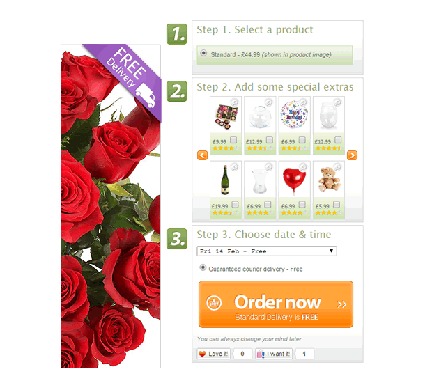
Serenata offer a clever three step process to complete an order, where step 2 includes additional lower ticket items to consider whilst adding an item to the basket. Although this is clever, it could get in the way for users not wanting to add extras to their order.
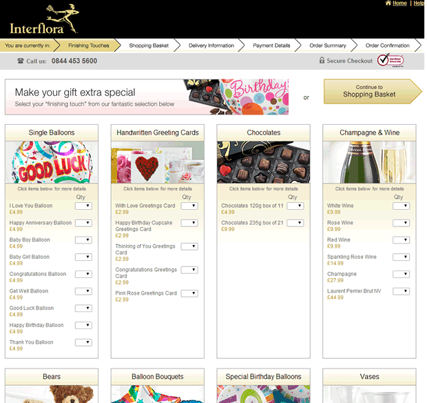
Once users have selected a product and a delivery date on the Interflora site, they are then led to a whole page dedicated to upselling before they progress to the shopping basket. This is a risky strategy that could lead to user frustration, however, Interflora try to minimise this with a clear CTA at the top and bottom of the page allowing users to skip easily.
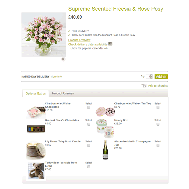
Waitrose offer a good example of how to upsell without getting in the way of users’ primary task. Here users are offered suggestions on the product page below the product information and the ‘add to basket’ call to action. This offers a good balance between business goals and user goals.
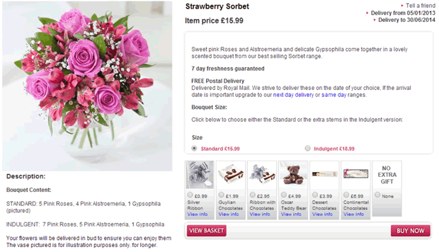
Aside from upselling additional products, online florists also provide some subtle price increases to get just a little more money from customers. For example, Flying Flowers present users with the opportunity to select either the ‘standard’ version or for a small price increase, select the ‘indulgent’ option. A very clever use of terminology here, who would want to buy a ‘standard’ gift, when an ‘indulgent’ gift was available for a few pounds more.
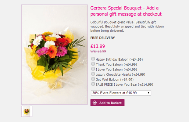
Another way to achieve the ‘enhanced’ option is to provide users with the opportunity to select more of the product. For a few pounds more, users visiting Hallmark Bouquets can choose 30% more flowers
Summary
It’s surprising what you can discover when looking at alternative industries. Online florists seem an unlikely source of inspiration but this ecommerce niche is a rich source of learning. Florist retailers serve an audience with an immediate, yet undefined need. The sites we’ve highlighted here do a great job of capturing attention, building trust and then directing users towards their solution. This is something that every website should be doing. Borrowing ideas from the examples here should lead to converting more visitors into customers and increasing the amount that they buy.
Key Takeaways
- Looking sideways at other industries can be a powerful tool to stimulate inspiration
- Flower retailers face unique challenges which offer useful insights for any retailer
- Building trust and communicating credibility early in the user journey is important
- Don’t assume customers know what they need. Offer tools to help them jump to products quickly
- Utilise simple but effective upselling tools to increase ABV
What are the other things that florist websites do particularly well? Are there any other industries that you would like us to focus on? Get in touch and we’ll make it a priority.
