It can be frustrating when, on settling into a new job, a UX Professional is asked to throw together a wireframe, as if that’s all a UX role is good for. A regular gripe I hear is that practitioners are not given the time to consider, let alone research, their users ahead of wireframing. Like when my kids claim to “love sausage risotto without the risotto”, this is like UX without the U.
Of course, in an ideal world there are many activities we can undertake ahead of wireframing. Our User-Centred Design Process has a whole Research Phase before we even consider wireframes. However, for many, and sometimes for us, there just isn’t the time or budget. Moreso if the project in hand needs to go live ASAP.
So, what do we do?
What we don’t do is panic and jump straight into sketching wireframes. We need to consider the user, and we need to begin with logic before we get creative. There is, therefore, a reduced process that we follow to ensure we approach this from a user perspective.
Once we have the brief from our stakeholders, there are three ingredients that we need to add before we begin wireframing:
1/. User profiles
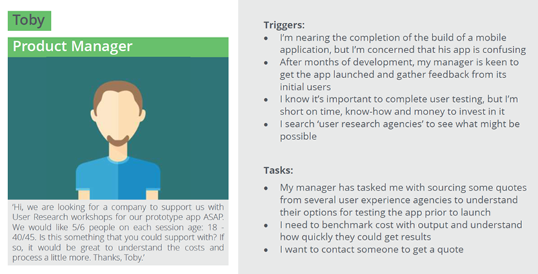
User profiles, or personas, are archetypes of your customers, which are created to be typical users of your website (or any product or service). In this example, we’re keeping the profiles at a high level and we look to include:
- Who are the core users?
- What is their goal?
- What questions will they need answers to?
We’re not looking for research here, we just need to shape the profiles on a collective understanding. To do this you can draw on your colleagues’ experiences of working with users, or chat to someone in your marketing, sales, or customer service teams. Also, consider any feedback and communications you receive directly from customers.
In our example here, we show a representation of how a user, who arrives on the Experience UX website, might look. We’ve created a story for Toby that represents one type of enquiry we sometimes receive via our website, and then we thought about what questions Toby might have.

Top Tip:
Imagine Toby with a beginner’s mind – what do you assume users already knows but Toby might not yet know? What basic questions should you cater to?
2/. Journey mapping
Now, standing in the shoes of each user profile, we’re ready to plot the journey for each profile to reach their goal, considering their needs and outside influence:
- Their journey prior to landing on the website
- Critical first visit questions: Can you help me, & how can you help me?
- Answer to user questions, as listed in the profiles
- Business objectives
- Appease any other doubts
This would be Toby’s journey into and through our website, taking into account what he needs, what will improve Toby’s experience, but also what would Experience UX like Toby to do.

Top tip:
It is useful to start by mapping Toby’s task on your current website and repeat this for each of your user’s tasks. With this insight, start afresh with a blank sheet of paper or whiteboard, and create a new journey map taking on the learnings.
3/. Content hierarchy
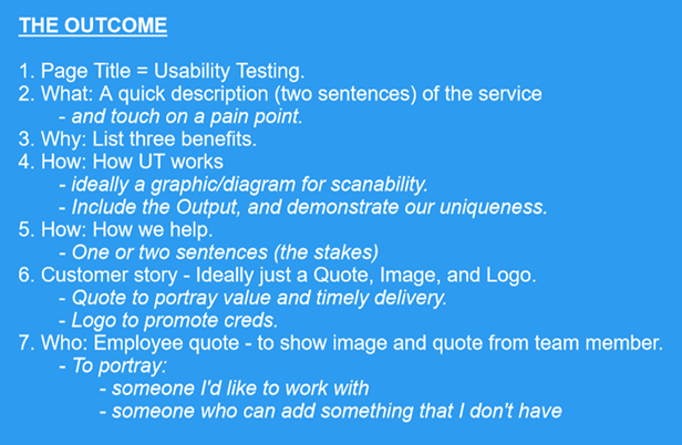
With the journeys mapped, we now list all the content and features needed along the path to help achieve the user and business goals. List the content and features, prioritised on its importance to the user and business, to create a draft order of page content. This will require a bit of toing and froing as you begin to balance the user and business needs but try not to over think it. You have a chance to flesh this out when you get to the actual wireframing.
The list below is the outcome for a landing page for Toby. You will note there is no detail about the content yet, it is simply a pointer to what must be included.

Top tip:
Keeping it high-level like this allows you to crack on and quickly shape your wireframes based on logic, without getting caught up in the detail of the content or the creativity of the final solution.
Why does this matter?
Firstly, we must realise that approaching our work from our own perspective is likely to be different to that of a user. These three tasks, which can be executed relatively quickly, provide you with a perspective that isn’t your own. This ensures you have a user-first basis on which to shape your wireframes and be able to explain this, with sound reasoning, to your stakeholders.
We understand that many new pages, or even user journeys, aren’t afforded the time and budget for a complete user-centred design process, so these three ingredients will help you to create wireframes with a hint of UCD, even if you’ve had to do it all yourself from your desk. With this process, you’re ready to shape your first draft wireframe, considering the content hierarchy, user journey, and user profile.
Now you are ready to wireframe, it should be noted that your wireframes, and the final content/design, must remain intuitive and smooth. You can’t go wrong following Robert Hoakman Jr’s ‘Three Rs’ from his book, Designing the Obvious:
- Requirements — only include things that are absolutely necessary.
- Reduction — remove as many screen elements, interactions and words as you can.
- Regularity — be consistent in formatting, layout and wording.

