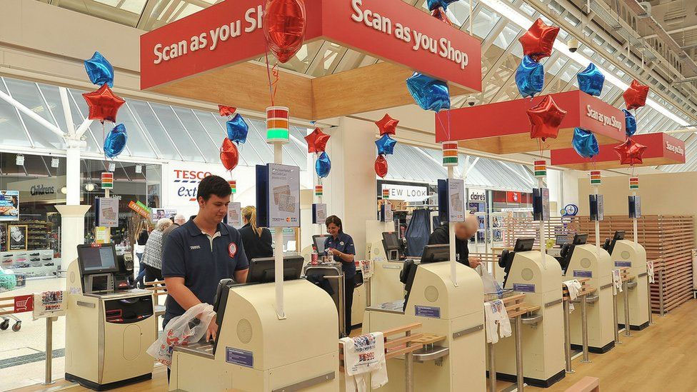
 It’s easy to see why retailers are turning to more and more self-service kiosks. They put the customer in control, they can reduce operational costs and they save on staff costs. When they are designed well they can improve customer experience because customers grab their goods and leave the store with minimal fuss. When they are designed poorly, they can be time consuming and frustrating having a negative impact on customer experience.
What we’ve noticed in our research is that many of the problems are due to designers and engineers not paying enough attention to customer needs. What the kiosk developers appear to do is take the service tills used by trained retail staff and then redesign the interface for customer use. Trained staff use equipment hundreds of times a day and learn ‘work arounds’ to their frustrations. Customers on the other hand use the equipment infrequently and have much less tolerance for frustration.
To help you make sure your kiosk provides a smooth customer experience rather than a frustrating one, we’ve put together a list of the most common frustrations customers experience when using self-service kiosks/checkouts:
- Poor product or service categorisation – Most kiosks require customers to identify the item before they scan it. Many kiosks haven’t spent enough time researching which categorisation systems are most logical to their customers, leaving customers struggling to locate the best match for their item. When they have a number of items to process, and the queues are building behind them, this can be a real source of stress for customers.
- Kiosks can’t support the speed of input – When customers gain confidence with the checkout and speed their rate of scanning items and placing them on the conveyer or into their ‘bag area’, the system tends to ‘get confused’ and appears to lag behind, issuing confusing error commands to customers asking them to perform actions they have already completed.
- Physical layout and ergonomics don’t support common tasks – Some of the popular self-service checkouts tend to force customers to shuffle between the main screen, and the payment mechanism placed beyond stretching distance away. Before completing their transaction they need to return to the main screen again. This often leads to customers over stretching or shuffling their bags while they struggle to complete their purchase.
- Touchscreens can be unclear – Many checkouts use touchscreen input and a common source of frustration with these are the readability of the screen due to glare from overhead lighting or from the size of the text on the screen. We have observed customers also struggling to know which areas are ‘clickable’ and which are not.
Whilst self-service kiosks become more popular, we feel it is important that they don’t fall into the trap that many websites did in the early days of web development: to assume that customers will adapt to the technology, rather than adapting the technology to the customers. In order for retailers to gain the benefits from self-service, they must ensure that the technology provides a smooth customer experience by focusing upon usability and customer needs very early in the product development lifecycle.
Does your self-service kiosk frustrate your customers?
