In our research, participants are often overwhelmed by reams of text, leading to a frequent recommendation to “reduce the number of words”. This is no new discovery, but how can we make our copy consumable?
Our brains are hardwired to conserve energy and burn fewer calories. We naturally and subconsciously filter and scan for relevant and valuable information. Perhaps it’s time for website pages to come with a calorie intake traffic light, as we see on food packaging? The ‘3 minute read’ labels are a possible step towards this, but I don’t feel these are the solution.
Respect my Finite Calorie Limit
Humans have a limited appetite for consuming words. Respect it. Do not ask your reader to gorge on a glutton of words. While you may think it’s a feast, their subconscious will ring alarm bells. Force feed your user and you can expect unsettled stomachs.

But How?
What can we do to make website content consumable? Here are five principles for respecting your reader:
1. Reduce Complexity
We often see research participants being confused by technical and overly complicated words. Do not use obscure, cumbersome, obfuscating, or needlessly long words (ahem!). Upon reading that text, your reader’s brain will immediately note that your copy is going to use up precious calorie resource. Cue a bounce to something more appealing.
2. Increase Appeal
Design your page’s content to be easy on the eye and scan friendly. Headers, bulleted lists, animation, quotes, white space, and good imagery are some of the elements that will make your content easy on your users. There are plenty of best practice guidelines on the internet.
Consider your smartphone users when, suddenly, they are presented a full screen of text. What looks OK in Word is suddenly ‘hurting my eyes’ on my smartphone. When writing copy, respect your reader by writing straight to your smartphone, or Inspect mode in-browser (toggled to mobile view). Writing for mobile-first demands that we write first on mobile.
3. Offer, Don’t Force
Provide the detail, just don’t force-feed it on to your reader. Sometimes, providing detail is unavoidable and invaluable. For such appropriately wordy content, use tabbed or accordion content, or ‘read more’ / ‘continue reading’ options. By doing so, you offer up the summary to the interested reader, but leave the choice to consume it in full in their control.
Notice when you find yourself happily consuming content on a website. Ask yourself what it is about the content that makes it easy for you to consume?

Example of detailed content within an ‘accordion’ layout
4. Reduce Word Count
Your challenge, should you choose to accept it, is to achieve what may well feel like an impossible mission: pare it back. And again. And again. It may well feel to you that you are cutting precious words, but challenge yourself with the question, ‘would my reader really miss this sentence?’ – Less really is more.
When drafting an article, I place a ‘cutting room floor’ at the end of my document, a throwback to dice and splice film editing, where editors would cut sequences of footage. Leaving words, sentences and paragraphs on my cutting room floor means improves my article, and I can come back to it later to use it as social media copy or in a future article.
At time of writing, this article has more than 300 words on my cutting room floor. You’re welcome!
5. Write Quality Copy
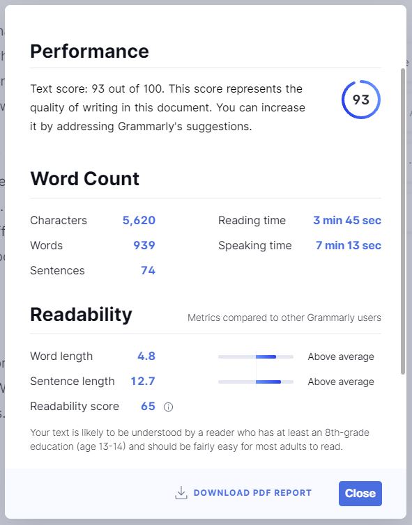
This, more than any of these five principles, should be a given. It is surprisingly easy to lose sight of your reader when crafting copy. Use free tools such as Grammarly to gamify and monitor your copy’s quality and quantity. Use the ‘time to read’ function to understand how much time you’re asking of your reader.
This article, post-editing, has a three minute 30 second read time and scored a respectable 94 on Grammarly. Anything less than 90 and I would not consider unleashing it on our readers. Use Grammarly’s helpful browser extensions and Microsoft Office add-on to assess your copy wherever you write it. How does your content score?

You may be at a stage where you need external and expert help. Engage usability testing to observe your reader’s unfiltered response to the words you serve. Seek the guidance and expertise of copywriters who will guide you to write low-calorie copy.
Control Your Copy Creep
Websites are living, morphing and growing beings that evolve and often snowball out of control. The challenge for UXers is to balance stakeholder demands with user appetite. Users do not have an insatiable appetite to consume words. Respect their finite appetite.
Yes, these principles are obvious and make for common sense, and are documented by more qualified experts than me. Yet, we still observe users ignoring copy time and again.
Am I practising what I preach? I’ve attempted to practice these principles and to respect your finite appetite in this article, but I’ll leave you to be the judge of that…

