Around this time last year, I sat in a room watching people talk about how dull and boring our brand was. The business I had set up with Ali eight years ago with so much hard work and passion was being perceived as dispassionate and ‘stuffy’ from people who were potential clients. Ouch!

It became clear that we had started to make some big assumptions about our site visitors. As this was something we warned our clients about, it was time to conduct UX research on our own website.
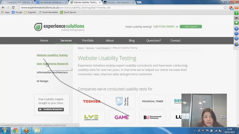
We recruited people who were representative of our target audience and got them to show us where they would go for help if their site wasn’t performing as it should. They looked at a variety of websites, from marketing experts to SEO consultancies. Then we asked them to take a look at a bunch of sites, including ours and our competitors. We wanted to see how easy it was to understand what the sites offered, and how Experience UX stacked up.
Here’s a clip demonstrating the lack of feeling towards our brand
What we learned was hard to listen to. The good news was, we weren’t offending people, they were able to find us ok, they could navigate the site, and overall, the usability of the site was fine. The real news was at a deeper level.
Part of our process ensures that we don’t just test usability, but we look at the entire user experience to see how users perceive the brand, how the site fits into the entire user journey, and what they feel the site offers over competitors.
By practising what we preach, we found our real problem: our audience didn’t feel anything for our brand. They felt we were experienced and competent, but a bit boring and uninspiring. Worst of all, they felt we lacked passion.
What we learned
We gained a new appreciation for what our clients feel as they squirm in their seats watching users struggle with their website. Our clients usually have an idea of what is wrong with their site, but often, what they think is a problem isn’t the real issue. It’s easy to be so close to your site that you just can’t see things from a user perspective. As UX specialists, we knew this, but we were still surprised at the extent of the differences between our and our users’ perception.
 Taking on board all the findings from our UX research
We also uncovered a critical insight that changed our business entirely. We found that our vision of our ideal customer was wrong. For eight years, we’d been trying to educate our users about UX and why they should care about it. But our research proved that our customers already know what UX is; they need to know why they should do it with us. Where we were failing was in providing a compelling case for why they should work with us.
What we did about it
Following on from the research, we developed an entirely new picture of our ideal customer. We ran persona workshops to draw up a new customer profile: a UX leader in a large client-side organisation who recognises the value of outsourcing UX research when their team is too busy, lacks experience, or is in need of an independent perspective.
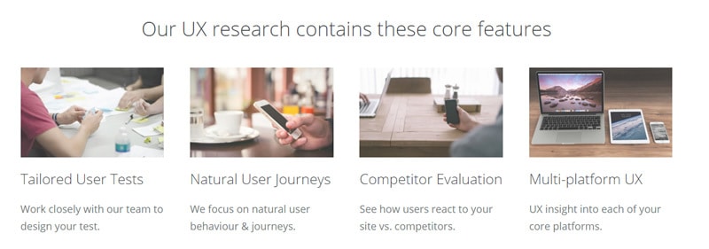
This new picture of our ideal customer led us to scrap our educational focus and helped us re-focus on the benefits we offer a Head of UX. We identified where our approach is different and more valuable than our competitors’ standard usability testing approach. We spoke with our existing clients about why they continue to work with us, and acknowledged four key factors in our approach:
- We tailor our research carefully to meet the needs of our client
- We try our best to capture natural user behaviour, rather than artificial tasks they would never normally do
- We always research our client’s site as part of their entire competitor landscape
- We test the entire user journey across all platforms and touchpoints
 Our new core offering focuses purely on UX Research
With our new-found focus, we decided to re-name our service from usability testing (finding problems) to UX research (understanding the entire user journey). We also felt it was important to move away from our broad service offering (research, wireframes, IA, and design) and focus entirely on user research. It’s the one thing our clients have trouble doing well in–house, and has always been our strength.
Considering the brand insights from our research and this change in business focus, we decided to rebrand. We developed our new website to let our passion shine through the content. Our blog re-focused on what Heads of UX need to ignite their passion and help them do their job better. We kicked off our new “UX Insider” series, with an aim to interview the top 100 UX leaders around the UK to help our real target audience, Heads of UX, gain insight into how their counterparts operate and solve the same challenges they face.
And lastly, we have renamed the business. Say goodbye to Experience Solutions… and hello to Experience UX.

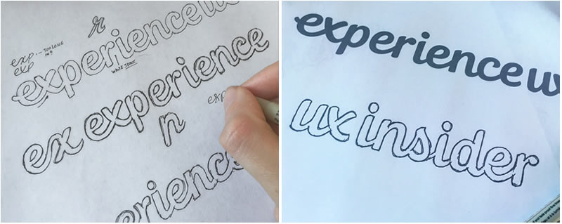
We put a lot of effort into creating a logo which communicates our new brand values: Friendly, Passionate, Professional, and Inspirational. After a lot of time with different designers, we chose a custom typography designer to work up our new logo. We’re delighted with the results, and feel our overall brand is much more coherent.
 The design process for our new logo
Watch this space, as we have another UX research project kicking off on our own site again in the next couple of months. Hopefully, it won’t lead to such fundamental change this time.
Love it? Hate it? What do you think?
