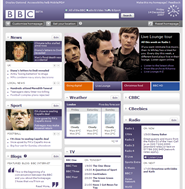
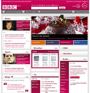
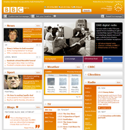
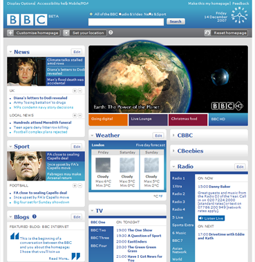
As a regular user of the BBC website and an ex-BBC employee, I find the new Beta of the customisable homepage an exciting concept. I love the idea of opening up my browser and seeing all the news and content I’m interested in, in one place. So, from my perspective it’s a big thumbs up.However, I am a little worried for the less frequent web user. The new web 2.0 style design with the customisable features on every item seems to add visual clutter and makes the simple task of scanning the page more of a struggle. The design is a little ‘in your face’ with the entire page changing colour when users click particular sections (see below), and the sheer size of the content makes me need to move away from the screen slightly to take it all in.


Being the BBC I’m sure there have been numerous usability tests to validate the concept, and allowing people to explore the Beta version before the change is made final is the best way to avoid the shock and horror usually associated with a major change to user expectations. So, I’m sure the BBC have it all under control, but I can’t help feeling slightly worried that the design of the new homepage has had a little too much focus upon the technology and not enough upon how to help users achieve their goals easier.
Whilst the new homepage can’t be described as offering a poor user experience, I would be fascinated to be a fly on the wall in the usability tests of the slightly older, less frequent audience as I’m not sure they will react quite as positively as I did.
What do you think?


