The Challenges
McCarthy and Stone came to us in 2016 with the challenge that they had a dated five –year old website that did not deliver the experience our customers deserved, nor the return on investment their business needed. They also lacked the drive internally for significant investment needed to improve performance and boost conversion and sales.
They persuaded their board and regional sales teams that outstanding digital experiences were key to meeting tough sales and growth targets set by McCarthy & Stone’s new strategic direction (a re-float on the Stock Exchange).
After secured board approval for two phases: 1) update of current site, 2) new website (once phase 1 results approved) we went through a formal tender process for CRO, User testing and analytics, and were appointed as the specialist on a two-year rolling programme.
Goals and Objectives
Clarity is key when it comes to effective and thankfully McCarthy and Stone set out very clear business and project goals.
- Increase units sold from 2300 to 2500 (2018) and 3000 (2019)
- Increase off-plan sales from 50% to 66% (2018) – with the website identified as a key channel to increase off-plan sales
- Enhance user experience for the customer and create higher sales conversion (see above targets) – tracked by analytics (Phase 1)
- Develop CRO, analytics support and user testing informing new templates of the homepage, search results page, development pages and forms
- Feed critical learnings into phase 2 in line with budget constraints
- Demonstrate the internal value of our digital team
- Increase customer visibility of our three lifestyle offerings
- Realign perceptions that McCarthy & Stone is more than a house builder, we provide unique retirement lifestyles.
They also knew they needed a shift in culture and that for us to see the bigger picture we needed input and buy-in from regional teams. So we aimed to pull in people to our workstreams getting a broad view of insights from people such as land buyers, house managers, call centre, HR roles etc., in addition to main stakeholders;
Project Kick-Off
With insights from 50+ hours of observational research and examining 100+ websites, our project partnership started in November 2016. Not only did we look at everything from a user perspective, but we constantly challenged the clients thinking and introduced new ideas.
The plan looked like this:
- Understand user profiles, assess website performance, identify user needs
- Create new user profiles, re-focus the website from product to user
- Make and validate prototypes
- Maximise analytics
- Quarterly regional visits to our sales teams
- Hypotheses for online forms
- Wireframe all user journeys
- Multiple rounds of *user testing
*Critically, user testing informed key marketing changes, e.g. that no service charge information was a barrier to sale, and that customers weren’t aware of the three retirement living offerings.
Stakeholder Engagement
The project team maintained close contact with the customers, leadership team, sales teams, and partners ensures we can listen to and understand all stakeholders’ needs – for buy-in to a programme which is as much about brand messaging as improving our customers’ digital experience:
The Executive Board whole-heartedly approved budgets once they understood the aims.
Customer feedback demonstrates users can find what they want on the site easily and we track their end-to-end journeys.
Quarterly visits to regional teams shared what we were doing, why, and how. We learnt first-hand of opportunities, challenges and how website changes were being received, incorporating feedback into designs and learnings.
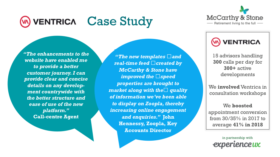
McCarthy & Stone’s contact centre team (Ventrica) depends heavily on the website as their primary source of development information. We spent a day with them listening to calls and speaking with agents and invited them to consultation workshops to ensure any changes made matched their needs.
Implementation
This is a story about implementing a digital project across two distinct phases. By working in partnership, feeding in learnings, and benchmarking against key deliverables via real-time analytics – we’ve achieved outstanding results.
We set out to implement the first phases – to make the current website work harder for the client. Although we had to accept the current platform’s restrictions, improving the user journey would meet short to medium-term needs – with success measured through conversion uplift.
Always reviewing Analytics and Tracking allowed us to capture data continuously and measure improvements to the website in real-time (also involving the use of split testing) – for digital ROI.
User Workshops (June-July 2017): We looked at user profiles, developed a prototype from the template designs, and followed up with further rounds of testing (see Figure 1). We also ran a second ‘refresh’ workshop in December 2017.
Stages in Form re-design:
Analytics revealed high drop-off during the form filling process. This three-stage form process showed 60% drop-off at stage one.
We addressed this at the specific workshop to review all form fields. We aimed to reduce fields down to a minimum to make it as simple as possible and to restructure questions to make logical sense.
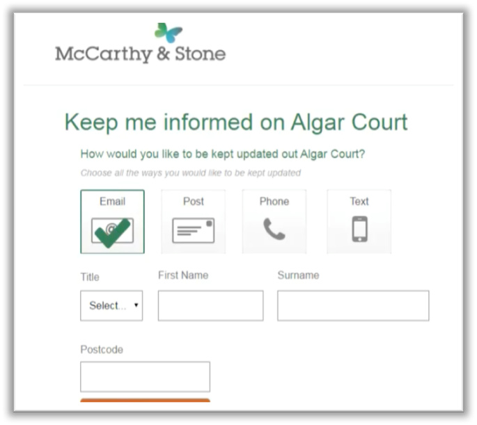
We ran a wireframe workshop to outline all possible user journeys e.g. by post by email, tablet and mobile, in consultation with our regional and CRM teams.
Finally, we turned wireframes (see Figure 2) into prototypes and conducted further agile testing in short time frames.
Impact and Benefits
We’ve seen a very healthy increase in sales thanks to the comprehensive user experience project undertaken on our website. Customers of all digital abilities can now access all the information they need to start the journey towards purchasing a quality retirement property. Conversions on our development pages have risen substantially, and we look forward to our digital projects delivering even further sales volumes in 2018.
David Bridges, McCarthy & Stone,
National Marketing Director
- 630 more sales leads converted
- 61 more visits to a development
- 8 more legal completions
- All per annum thanks to new development page templates where 1/3 of customers start the journey.
- 66% off-plan sale – exceeding 50% target- with 6 sites achieving 80%
- Form completion: 20% increase in form completion rate with 45% conversion = 7 more sales leads per day, 248 additional visits to a development and 33 more legal completions
- Increased internal visibility and trust: Previously sceptical regions have a clear understanding of ‘what UX is’ and the benefits website changes bring to customers and our business.
- Increased online engagement/enquiries (Zoopla)
- 9% uplift in conversion (YOY) for Ventrica (Contact Centre team)
What we learned
All parties have learnt from working together in this successful strategic partnership.
The learning, insights, and data delivered so far will lay the foundations of the new look website.
LESSON ONE: Getting early involvement and keeping people informed is key to smooth implementation
Including the regional teams was hugely beneficial. They saw first-hand that the programme was well-researched and could relate to their business strategy. Not only did this raise the profile of the client’s digital team but it also gained buy-in to implementation. Where previously they had struggled with rolling initiatives out across the UK and new processes had been hard to implement, they now understood the benefits.
As well as their involvement in workshops, Experience UX also gained from seeing the bigger picture when we invited them to attend our national sales and marketing conference.
LESSON TWO: User-centric design
Thanks to user-led strategy and solutions, we’ve successfully made the site easy to access for older people who are not always comfortable with technology as well as for key third party influencers. At the same time, we’ve helped the sales teams deliver outstanding customer experience and maximise sales leads, conversion and business growth against their targets.


