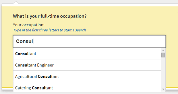
Nearly every insurance quote form requires users to enter their job title. If your form is one of these, chances are that it’s causing users an issue and ultimately turning their experience a little sour. We’ve observed hundreds of participants struggle with this field during usability testing, but luckily we are seeing some good approaches emerging and we wanted to share one of these with you.

So what’s the problem?
Participants need to select a job title from a specified list of professions supplied by the Association of British Insurers. At first glance the input box looks like a normal free text field. In our extensive insurance UX tests we’ve seen that participants tend to look down at the keyboard when entering this information and do not realise the list of jobs is filtering as they type. By the time they look up when finished typing, they are faced with an error message telling them their job has not been found. See an example from a recent usability test we did on a home insurance form:
How can you avoid this problem?
If you want a quick fix or even just some food for thought, you should check out Google Compare for a great example.
1. Google reassures users by explaining why they are asking for this information
2. They provide contextual help to guide users through the question and ensure they can recover from errors easily
3. The best thing about Google’s UX is that when your cursor enters the occupation field, a list of occupations is immediately displayed. Users instantly know that there is a list of jobs to choose from, and as users start typing it instantly filters the list. See for yourself below:
We think Google’s solution will test really well with users and as soon as we’ve tested it we’ll update this post. In the meantime let us know if you have seen a better solution to this problem that you think we should test with real users.

