When customers are comparing different products, we often find that product pages with videos give people more confidence in their purchase. It’s no surprise to see online retailers try to integrate more videos into their sites. In an attempt to convert more visitors to buyers, some brands have turned to interactive videos as a tool to inspire customers. So what’s the experience like from a user perspective? Does it add value? Or is it just a gimmick?
We reviewed some interactive videos which showcase a selection of products. Each product shown in the video has a clickable hotspot which allows users to click through to the product page and buy that product. Whilst this sounds like an excellent way to engage with consumers, we found the user experience to be clumsy and irritating. In this article we show some examples to demonstrate the user experience of each interactive video.
Coach

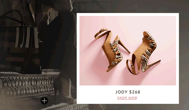
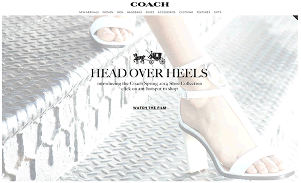
The first site we reviewed was the luxury retailer, Coach. They offer a large video on their homepage demonstrating their Spring shoe collection. Whilst the video is beautifully shot, the user experience feels a little awkward. As you can see in our video below, the clickable area moves alongside the product. As the lady in the video walks along, users have to chase after the button to try to click it. This leaves the experience feeling far from luxury.
Interactive ‘Shoppable’ Music Video

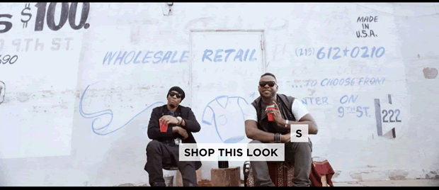
Whilst searching for more examples of interactive videos we found a video claiming to be the ‘World’s First Interactive Shoppable Music Video’. Whilst the video was energetic and compelling we had the same problem: needing to have lightning quick reaction times to click the button ‘Shop This Look’ before the video frame changed and showed a different look. Having to pause and rewind the video to find the products being shown feels like a poorly implemented solution. We feel that by increasing the amount of time each ‘look’ is on screen, users would find it much easier to interact with the video.
Gucci

Gucci’s video makes it much easier for users to click the product, with a much larger clickable area. However, we feel further research needs to be done with users to make sure this doesn’t get in the way of viewing the video. One great thing about this example is that the product thumbnails are shown on the right hand side, giving users a second way to navigate to the products.
Barneys New York

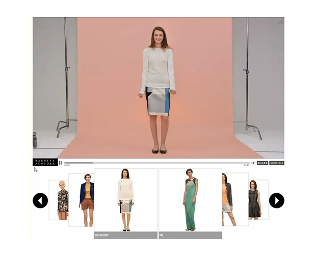
The best solution we saw was on the Barneys New York website. This allowed users to view the video easily with the corresponding outfit available below the video player. This worked well because the pace of the video was much slower, allowing users the time to decide if the outfit was something they liked and wished to see more of. The interactive element was separate from the video which made it easier to interact with.
Summary
It’s clear to see why retailers are turning to new ways to merchandise their products. As video has become an important part of the purchase decision making process for customers it seems natural to explore this technology further. Based on our short review, interactive shopping videos are an interesting approach which customers are likely to see more often when shopping online. However, based on our review, the user experience feels like an afterthought and is unlikely to boost conversions until they offer customers an easier, more pleasurable interaction. As with most new technology, retailers should follow a more user centred approach to ensure the user interface is fully considered from a customer perspective before implementation.
Key takeaways
- Interactive videos for ecommerce brands are becoming more popular.
- The technology offers an interesting new way to merchandise and inspire customers.
- The interaction can be clumsy so the user experience needs to be considered and thoroughly tested.
- Clickable hotspots should be easy to click on.
- The pace of the video should be slow to allow users to consider products properly.
- Product information should be available outside the video for a smoother experience.
What do you think? Are interactive ecommerce videos here to stay, or is it just another cool technology retailers are jumping into without fully considering the user experience?

