When usability testing charity websites we see the same user need being unfulfilled time and again. Before making a decision to donate, volunteer, or fundraise for you, users need to know where the money goes.
They’ve heard about charities eating up all the money themselves and only a small amount getting to the people who need it. They want to know your charity isn’t like that. But you also know that users aren’t going to read your AGM notes and won’t invest time reading about your financial structure. So what do you do? In this article we’ll show you some of the sites doing it well and give you some inspiration on how to fix your site to generate more online donations.
Offer a simple ‘where the money goes’ graphic
The simplest way to show users their money is going to the right place is to show them where the money goes using a basic graphical representation of the income you receive and what happens to the money. Users just need a simple understanding to tick the box in their mind which either adds you to the credible list, or puts you in the reject pile. Here are some examples of how some charities have done this well:
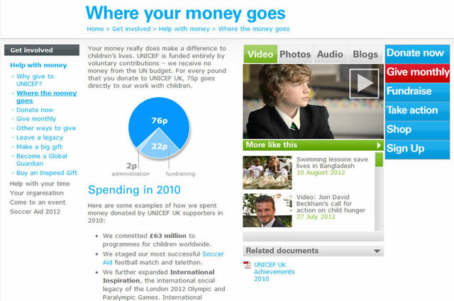
Unicef provide a page summarising where the money goes with a simple pie chart and a summary of their spending in 2010. A little out of date and wordy, but still a useful overview.
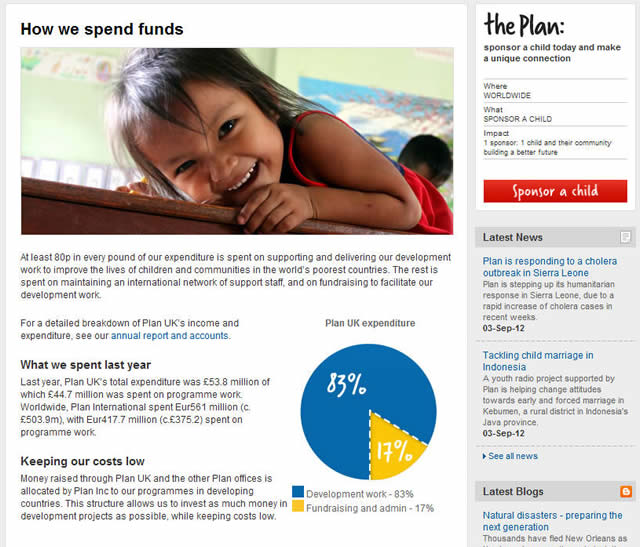
Plan UK is one of our clients and testing showed that users struggled to understand where the money was going. We recommended they create content for this and then in subsequent usability tests we found it worked well.
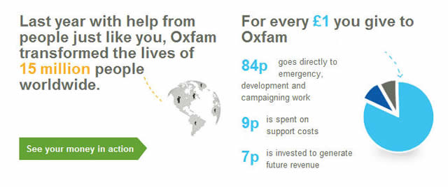
Oxfam provide a very simple overview using a pie chart. Like Unicef they also provide a useful understanding to show what happens to the money from every £1 donated. This is a great example of how to cover this off for users in a very small piece of real estate with a link to find out more.
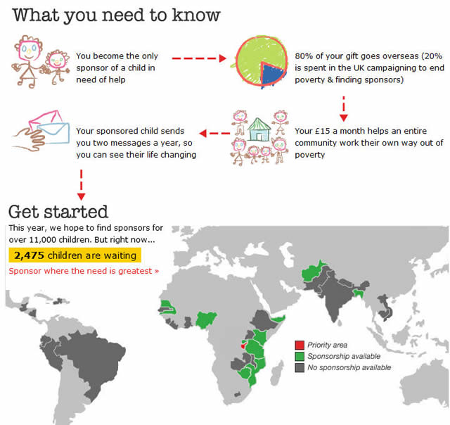
Action Aid take more of an infographic approach which incorporates a summary of what happens with the money donated as well as a good overview of how users can help.
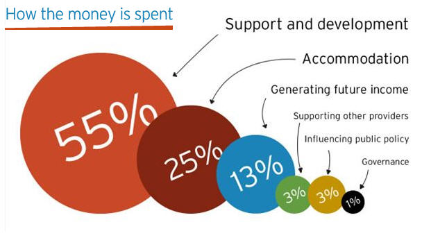
Centrepoint show that a pie chart isn’t the only way to show this information with a very simple breakdown of where their money is spent.
Key takeaways
- Show simple overview of where the money goes, a simple pie chart is enough (Unicef, Oxfam, Plan UK)
- Infographics can be a useful way to demonstrate lots of information easily (ActionAid)
- A breakdown of how the money has been spent is useful (Centrepoint)
- Simplifying the spend in terms of pence in a pound is useful (Oxfam, Unicef)
Provide evidence of what impact the money has had
For some users seeing a basic overview of where the money goes is enough to move them on to donations. However, for other users in our research, we’ve seen them look more into what the charity has actually achieved. They get an overall sense of what causes it supports, but often we observed users seeking direct evidence and tangible examples of what impact the charity has had. Users want to see the good their money can do.
Ideally they want to see brief case studies and news stories showing some of the recent success stories you’ve had. Giving them a basic overview of some recent projects with some engaging content such as video and photos would be a fantastic start, however we struggled to uncover many good examples of easy to find summaries of the impact voluntary support and donations have had. Our recommendation is to stop hiding this content deep in the site in impact reports, newsletters, and PDFs and bring it right to the front of the website. Show the proof of what successes big or small you’ve had in the last year. Here are some of the better examples we found, but we did struggle to generate many great examples:
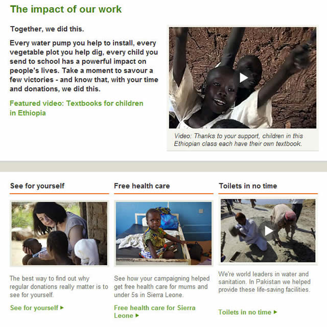
Oxfam provide an area titled ‘The impact of our work’ which provides compelling video and imagery. The layout of the content also allows users to scan the content and get a good overview of what Oxfam are doing.

Shelter provide an excellent visual slideshow which takes users through a summary of their recent achievements. The content is visual, doesn’t take too long to go through, and easy to digest.
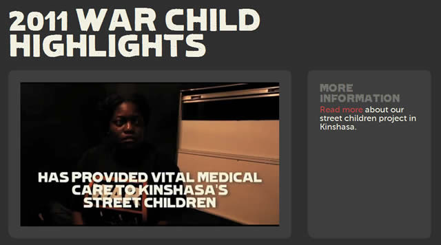
War Child offer a video highlighting the impact of their work last year. Users get an excellent visual overview of what the charity has been doing.
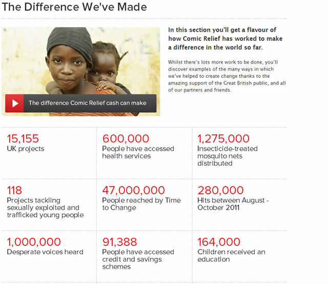
Comic Relief offer an excellent statistical view of the difference they have made. This is an excellent way to deliver a lot of information in an easy to glance manner.
Key takeaways
- Not many charities do this well
- A well presented statistical summary is a useful option if you want to avoid detailing recent projects (Comic Relief)
- Simple and easily digestible chunks of information showing this year versus last year is useful (Shelter)
- Videos and images offer compelling ways to show impact (Oxfam, War Child)
- Using inclusive language such as ‘see for yourself’, ‘we did this’ helps users engage (Oxfam)
- A section called ‘2011 highlights’ is a useful home for this content (War Child)
Helping users understand where the money goes and what impact their support will have in tangible, easy to understand ways is critical to receiving more support through your website. With these examples you have some inspiration to take action on your website. If you’d like to talk to us about how we can help you generate more revenue and support online, please get in touch.

