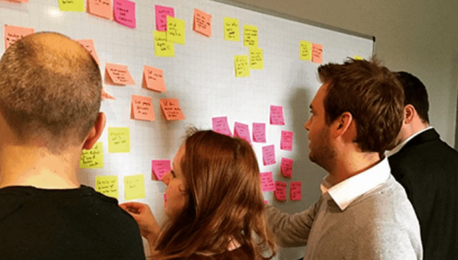
It’s 8am on a dreary Monday morning and you need to book a doctor’s appointment; that shouldn’t be too difficult, right? In a bid to generate ideas for a healthcare UX research and innovation project, it became clear that this can be a real headache (excuse the pun) and that it’s not the only area of healthcare that is lacking in experience design.
Going round in circles
We’ve all been there, stood at a crossroads of yet another set of identical looking hospital corridors that seem to stretch on for miles. That is only of course if you managed to find and pay for a parking space in time to even attempt to get to your appointment. According to a recent study, almost 7 million outpatient hospital appointments are missed each year in the UK, a lot of which have been attributed to patients not being able to navigate to their appointments. We came away from our session feeling like we had put the world to rights, and with a real urge to go to our nearest hospital and start fixing these experiences for hospital users.
When’s the last time a poor healthcare experience led to a swear word filled rant to a friend? Did it take you all day to try to book a dentist appointment? Or maybe you’re fed up of trying to track your fitness with a wearable device but not really knowing what all this data means or even if it’s accurate.

It’s clear from our quick Friday afternoon brainstorm that there is a lot of poor experiences when it comes to healthcare. No doubt you have plenty you can tell us about too. Here’s a summary of the kind of issues we uncovered:
- Booking an appointment with the doctor or dentist can be a painful process and rearranging one can be even worse. We shared a number of poor experiences here and it was clearly a common source of frustration.
- The doctor’s appointment itself can feel rushed, sometimes leading to medication that you didn’t want or are not sure why you have been prescribed it. The patient experience clearly needs more work.
- Arriving at a hospital is daunting; after the usual scramble for change to put in the pay and display machine, you’re often faced with deserted hospital receptions and confusing signage. You rush to get there in time, arriving flustered only to be met by a long line of people waiting.
- Receiving treatment or having to stay overnight in a hospital can throw up all sorts of challenges, from not fully understanding what is happening with your care, to trying to rearrange the bed into a comfortable position.
- To try and stay fit and healthy we have started to use wearable activity trackers, but we felt these devices overwhelmed us with data that we had no idea what to do with, we questioned their accuracy, or we didn’t feel they offer any real value because tracking your bike ride runs the phone battery down so quickly.

Our next step is to focus on one of these issues at a time and kick off an internal project to make something happen. First we want to do some ethnographic research and see people’s experiences first hand. We’ll interview healthcare users and try to fully understand where the gaps are in the experience currently. Then depending on the issue we’ll work on mock-ups of a better user journey and a less stressful user experience. If we feel we’ve got something good we’ll invite others to get involved and help us make it happen. We’ll keep you updated with our progress here.
Tell us all about your biggest healthcare bugbear and we’ll add it to our wall of healthcare shame.

