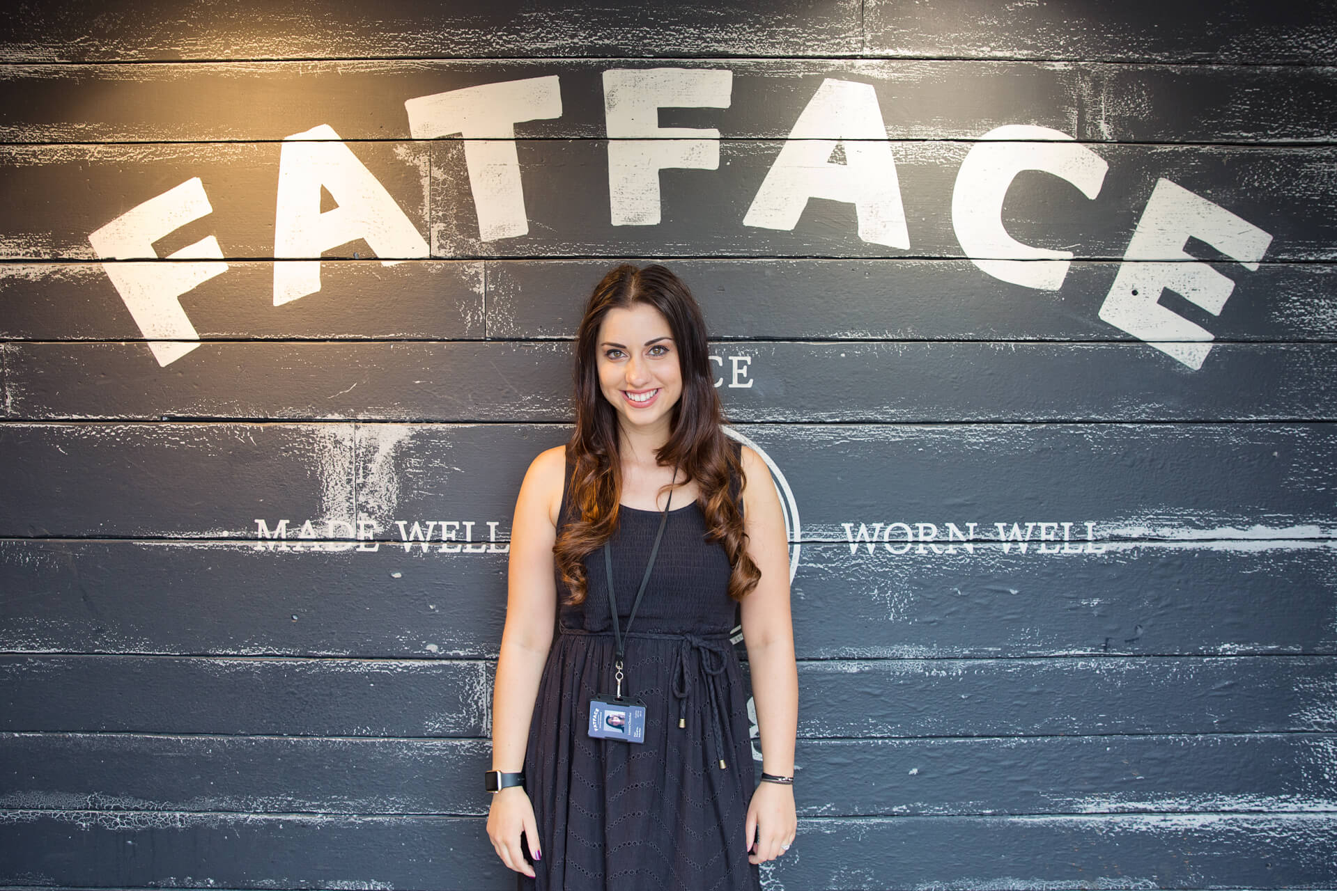
In our latest UX Insider interview I talk to Leanne Churcher, UX Lead at clothing brand Fat Face, about UX challenges for fashion brands and how to introduce UX change as a team of one.
Can you start by telling me a bit about your job and responsibilities?
I’m the sole UX designer at Fat Face and my responsibilities are to implement the UX process within the organisation and carry out the duties of a UX designer. It’s a new role for Fat Face and they wanted me to come in because they hadn’t had anything like this before – they’d used agencies but wanted someone in-house.
And how did you get into UX?
I started off in QA, but within that role I was getting to the point where I had to go through certain journeys when I was testing and I found myself thinking ‘why has this been done in this way? Maybe it should have been done differently, because as a user this is very confusing’. So I started to log these things – they weren’t bugs, but they weren’t great user experience either – and the company I worked for at the time didn’t have a UX team so there wasn’t really a place for my comments.
I moved on and developed my passion for UX while I was still working in QA and then moved into a junior UX role, before moving to a full UX role at Conde Nast International. And from there I came to Fat Face, where I’ve been for just over 18 months.
What sort of things are you working on at the moment?
At the moment I’m creating personas with marketing and other disciplines within digital, I’m running workshops and I’m getting to know the disciplines and how other people work, and how we should be collaborating to build good user experience. The other departments have such great experience in this area, so I think collaborating is very important.
And who’s a typical Fat Face user?
The average age of our users is about 41 at the moment but we want to target slightly younger people as well so we’re working on that. Typically our users are chilled, laidback, outdoorsy people, but people who like to be comfortable. Fat Face was started by two guys who sold T-shirts to get enough money to carry on skiing. The brand is about living your dreams, but being active and comfortable at the same time.
“We wanted our customers to have an easy way to shop in all genders, so they’re very clearly laid out but once you’re in one journey it doesn’t mean you can’t change.”
The Fat Face website has a fairly traditional navigation, but the categories for ‘men, ‘women’ and ‘kids’ are a bit different, can you tell me more about how that works for users?
I think the left navigation is quite a standard thing now if you look at other websites, so we were leading the way when it was first introduced. We wanted our customers to have an easy way to shop in all genders, so they’re very clearly laid out but once you’re in one journey it doesn’t mean you can’t change. We’ve made that very easy for our users, so you can open and close different tabs as you’re browsing and things like that. I think the navigation currently works well, but obviously you can always make improvements from a UX point of view.
I’ve heard Fat Face is intending to move into the US market and I was interested in whether there’s a difference in terms of user behaviour in the US vs the UK?
What we’ll eventually work on is a localisation initiative. But at the moment the site is a copycat site to allow us to branch out to the US audience with the correct currency. What we’d like to do is make it an experience more suited to international users because although they’ll be very subtle changes I think it will make a difference in how people shop and how they’d like to shop.
Mostly it’ll be little things like spelling, calling it a ‘shopping cart’ instead of a ‘shopping bag’ and delivery initiatives are slightly different too. I believe in the US it’s much more focused on strong customer service and so American users expect a lot, as they should, so it will be about driving initiatives like that through the website.
“Our users are our number one priority. The priority list of what we need to do is driven by what’s affecting them the most”.
How do you make decisions about what to change on the site? Is there a process you follow?
If there’s an area of the site that we want to change I’ll start with research. What I’ve found really useful, which is a little bit different to usual UX research, is working with our customer services team. It’s allowed me to see a completely different side, and discover things about what our actual customers are experiencing on our website. I’m able to see patterns and so that’s a great starting point for me.
I’ve also started running workshops, which allow us to really understand our users’ pain points and go from there, and user testing is excellent on any big project.
In terms of what we work on, our users are our number one priority. The priority list of what we need to do is driven by what’s affecting them the most, what’s stopping them having the best experience or shopping with us. But the approach I take from a UX perspective depends on the type of problem or the part of the site I’m working on. Saying that, there are some things like story writing, doing research and testing that are always essential.
And what sort of research do you do? How do you go about it?
Talking to our users is our main thing. I’ll build a prototype, put it out to them and see how they feel about it, what they do or don’t like. But other disciplines are really helpful too, and other people around the business have got some great ideas so it’s about being collaborative and really putting the users first.
We have online forums, and in particular we work with users that we’ve screened. So they’ll be Fat Face users within a certain age range who have shopped with us before. Usually we give them certain tasks to do and they say how they feel as they’re doing it and what they’re learning from it, what they like, what they don’t like, and so on.
We do it online and in person, but we’re finding online to be really great at the moment because it saves a lot of time and the questions are already pre-prepared, so they could all be doing it at the same time rather than me interviewing them one-on-one.
The other thing I like about online is that people are working on your website in their normal environment so they’re doing things on devices that they’re used to using, which makes it a comfortable way for the users to interact with us.
That said, I do like to interview one-on-one also because you can gauge the emotion much more easily than on a computer, so it’s great to do both.
“It’s about introducing UX with a rationale and the data to back yourself up.”
Do you ever get any resistance based on your feedback from testing?
Sometimes. Of course, different disciplines have different ways of doing things, so it’s about introducing UX with a rationale and the data to back yourself up. It’s explaining that you’re not doing it for no reason, that it’s come from what our customers are saying, or what this data is showing.
But I don’t think it’s about resistance, I think it’s about introducing our other disciplines to UX, because it’s very new here and so it’s a massive change. But once they start to see the results, they get a better understanding and then they become more involved and passionate about what we’re trying to achieve.
You mention data there, what sort of data do you use?
Marketing data a lot of the time. We have a really strong marketing team here and they do a lot of customer research. I’ve also created personas – so looking at the data through the eyes of the different types of users and looking at how certain people would do certain journeys, because I can have one journey but lots of different types of stories depending on the persona. It makes it a lot easier for other people to understand and bring it into their way of working.
Can you give me an example of a positive change that’s been made to the site based on user research?
We launched a Lookbook quite recently and we developed that by listening to our users. We put it out to test to find out what they wanted to see. A really large percentage of users responded positively to large imagery, as well as a number of other things, so we put that into our requirements and built that via user feedback. It did really well.
What sort of challenges do you face in your role the next 12 months?
Implementing UX processes and standards and getting other disciplines on board is quite a challenge but it’s also a good thing, but we’ve got a lot of projects coming up, which will be a personal challenge for me, but I’m confident that we’ll be able to pull it off and create an excellent experience for our customers.
When you look back in six months’ time on what you’ve been working on how do you know that it’s been a success?
Our users are very vocal on social media so their comments are one measure. Also the way business is going, conversion, that always helps. However we mainly measure our own success by the user acceptance period, and the testing afterwards. We test throughout projects with the users in mind, so after we go live we re iterate to make sure we are still in line with our users wants and needs.
Have you got any examples of anything you’ve worked on recently that you’re really proud of?
My first project here at Fat Face was a Christmas gift guide. It hadn’t been done in this way before and was the first project that UX had done. People were nervous about it, but I was confident that they’d done the research and we collaborated across all the disciplines – developers, marketing, trading, we all came together, said exactly what we wanted and I put that into wires and prototypes and it performed really well. I was really pleased with it, and how, with me coming into the role, everyone really took the ideas on board and understood. They really wanted to go for it even though it was completely different, and I think that was a great win for us because it was totally different to what we’d ever done before, and it worked.

So what’s the team set up here? You’re obviously the only UX designer, so who do you report to and who do you work alongside?
At the moment I’m part of the projects team, which consists of development, project management and UX and there’s also a large design team asFat Face were predominantly print and catalogue first and of more recent years they’ve moved into digital design. So I work very closely with design, development, project management, and trading.
What’s the most valuable thing that you’ve learned at Fat Face?
Collaborate. Which for me is really important in my current role as I’m a team of 1. I’m used to working in quite large UX teams so this is definitely different for me, but I’ve really enjoyed working with people who think in different ways. Getting to know different disciplines and seeing things from a more empathetic view rather than rigidly sticking to the ‘best practise’ process has definitely helped.
What’s the best part of your role?
Being able to make a difference. I really understand how frustrating things can be when you’re shopping online and you want things to go right, so to be able to have the impact on a site, to make things better for people, I love that.
And what about the hardest part of your job?
The hardest part is accepting you don’t always have to be right. I think it’s good not to be right all the time – you have your rationale but then someone says something else that you think is really excellent. For me it’s great for learning, but because I’m a team of one sometimes it can be quite frustrating because I don’t always have anyone to bounce off of.
“I think it’s important for any UXer to be good at communicating and have a passion for the users because otherwise what are we doing?”
Have you had to learn how to communicate differently when working with other disciplines?
I think in a UX role you need to be able to communicate effectively no matter who you’re talking to, whether it be stakeholders or other people with an understanding of a technical discipline, to really get your point across and explain why things are being done the way they’re done. I think it’s important for any UXer to be good at communicating and have a passion for the users because otherwise what are we doing?
Do you have any favourite methods or tools that you rely on for your role?
I love a workshop, I love a post-it note, and I love putting things out so people can see them. People interact more when something’s fun. Experience mapping is always great too, and in workshops I find it really helps me understand people’s journeys and how they’re feeling every step of the way, which is really important for me to be able to create a positive experience for them.
“I think it’s key to have the patience to understand all sorts of different people from all sorts of experiences, because that understanding can really make the experience you’re trying to create a great one rather than a sub-standard one.”
Have you got any advice on how to run a good workshop?
Make sure you’ve got a lot of different coloured post-its! But in all seriousness, make it more interactive. Instead of talking at people and asking them questions I now get them to split off and do certain tasks together, so they have to come back and tell me what they’ve done rather than me telling them all the time. That helps a lot because it gets people’s minds working. It’s quite hard to listen for a long time and take on all this information, so if they can create something they’re more inclined to want to be part of it and give ideas, so that’s probably the thing I’ve changed and implemented into workshops the most.
I think it’s key to have the patience to understand all sorts of different people from all sorts of experiences, because that understanding can really make the experience you’re trying to create a great one rather than a sub-standard one.
What one thing could you not do your job without?
My prototyping tool – Axure. I love it, it enables me to not only talk about how something could be done, but to show it. People are very visual so if I can show them they’re more likely to buy in to what I’m trying to sell. For me it’s a role changer and makes my life so much easier.
“Sometimes I think the pressure to innovate can take over the customer experience.”
What’s the biggest UX mistake you’ve made in your career and what have you learned from that?
With UX I think we are expected to do a number of things. On one side we have to create a seamless, beautiful, positive customer experience and on the other we have to constantly innovate. Sometimes I think the pressure to innovate can take over the customer experience and although I haven’t let that happen for anything that’s gone live, it does happen when stakeholders want to do something different, or something new. But you have to remember that the best experience is to simplify. So I think sometimes the pressure to innovate can make creating a good user experience slightly more difficult for me.
We can’t know everything, so is there anything you feel you need more knowledge on, in a UX context?
I want to know everything, but specifically I’d love to know more about our users. We only see them from a certain point of view when they’re looking at our site, but I’d really like to get inside their heads and understand how they’re feeling about certain things. I think sometimes people don’t tell us everything they’re thinking.
Where do you go for inspiration? Are there any sites that you look at and think, they’re doing it really well?
There are so many new sites out there that are doing it so well for their demographic. Website development and design is changing, it’s getting so much better. Zara is one example where they’ve recently changed their website and personally I think it’s excellent for their demographic – they’ve got large imagery, their homepage is engaging, really different and easy to navigate around and I think that’s all really important.
And are there any other industries you look at, any other types of ecommerce?
I usually do stick to retail because that’s the category that Fat Face sits in, but not necessarily fashion. For instance, the big department stores are great because they sell product on such a large scale. It’s interesting to see how they handle certain things with such large listings, because that can really make a difference to whether a user stays or not.
Are there any books, blogs, or podcasts that you could recommend?
Luke W is excellent. Some of his ideas are so out there but they’re just so innovative, and very clever. He’s got a real passion for what he does and I think that makes such a difference.
I also really like TED talks, even though they’re not about UX a lot of the time, they can be quite technical and help people understand a certain way of thinking which I think is really important. I’d say always try to read something new, even if it seems out of the box or unusual, because it can be great knowledge to have that you can put into your work.
If you had no budget or technical constraints, what would you change about Fat Face and/or the website?
I would love to build a UX empire and have more resource, because although we’re making big changes it’s still on quite a small scale and if we had more people on board I think what we could do would be mind blowing. So for me it would be expanding so we can really focus on our site and user experience.
“I think ecommerce is slowly taking over in-store, so it will need to become as easy as possible, but still allow you to get the feel and sense the quality of a product.”
What do you think will be different in five years in the way that we buy clothes online?
I think a lot of things will change in terms of how we check out – it will become very easy with the technology that’s happening right now with finger print scanning and contactless payments. I think e-commerce is slowly taking over in-store, so it will need to become as easy as possible, but still allow you to get the feel and sense the quality of a product.
————
Thanks for reading. If you have any suggestions on how to make these interviews better, please let us know.
Check out more in our UX Insider series


