What is it?
Crazy Egg is an online tool that monitors individual pages from your website, giving you a breakdown of where different visitors have clicked and on which part of the screen. There is also some more basic analytics data available on which pages have been viewed most frequently, and where your visitors have come from using different visual displays.
All you have to do is insert a small bit of code into the html of the page you want it to monitor, and sit back and relax. The site does it all for you from then on providing live results as it tracks the progress and every click that visitors make on the chosen pages.
What are its advantages?
Simple steps to set it up. Probably the best advantage of Crazy Egg is that it’s easy to setup on any website providing you have access to the site’s code. In just three steps you can set up Crazy Egg to monitor as many pages of your site as you wish (With a free account you can monitor up to 4 pages. To monitor more you have to upgrade to a paid account but prices start at as low as $9 for 10 pages which is peanuts really).
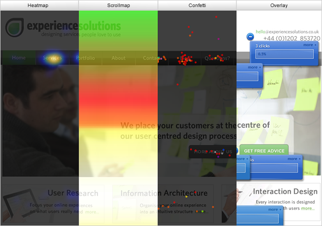
Five different and interactive ways of viewing the results. Crazy Egg provides you with an array of different ways of viewing the results; each has their own uses and will cater to different peoples’ preferences of viewing information.

The four different visual views the Crazy Egg provides; (from left to right) heatmap,
scrollmap, confetti, overlay
Now all the different views certainly look eye catching and interesting, but the one that we think is the most informative and useful is the confetti visual which displays all the clicks in a colour coded fashion giving you the option to filter which clicks from which external sources you want to see displayed on the page. The other views certainly have their uses too and collectively provide back up evidence to support theories drawn from the overall information gathered. For example, the scroll map in conjunction with the heat or confetti map can give you a good gauge as to where the most focused part of the page is and whether users are clicking on your call to action buttons within those areas.

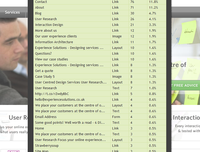
The list view is the last of the different states and displays a table of the items
clicked on within the page
Exportable reports of your results. Crazy Egg allows you to export a report of your results which is good for sharing and bringing them to meetings. The different views also allow for an interesting display of information (not the normal pie or bar charts). A slight limitation of this however, is the fact that it merely exports a ‘screenshot’ of your snapshot in the visual that you viewing it in when you click export report.
Crazy Egg data can aid design decisions. The information that Crazy Egg provides about your website pages can prove helpful when discovering what elements of your website need to change – to be moved or altered aesthetically to enhance their use. As I mentioned earlier, the accuracy and specificity of Crazy Egg is really where its advantage over other analytic tools such as Google Analytics lies. In allowing you to see exactly where your users are trying to click, or more importantly where they aren’t trying to click, it allows you to make informed conclusions of where potential areas of improvement are within the site. Finding out what improvements, however, requires more research than Crazy Egg can provide.
What are its limitations?
Despite many claims it is not a usability tool. Don’t let the reviews fool you. It can be helpful in allowing you to spot a problem such as a button that does not get used, but it doesn’t give you any other information as to why people aren’t clicking on that button. You can make assumptions from the data that Crazy Egg gives you but each assumption you make could create yet another problem. Still, once the problem is spotted, these questions can easily be resolved by investing in a proper usability test of the site.
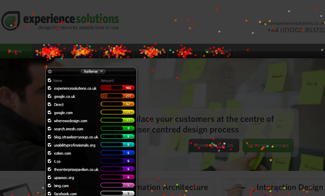
The confetti visitor box doesn’t move off the snapshot. When viewing the confetti results there is a little black box that lists the different visitor information for you in one area. However, the box is within the captured shot or ‘screenshot’ of your page, and so at no point can you see the whole page on its own. I realise you can minimise the box but even then I found it distracting. This might just be a pernickety personal irritation but I found it quite frustrating when trying to see the spread of clicks across the page.

The information on each type of visitor is displayed in the box above which cannot leave the screen
You can only compare two ‘snapshots’ via the heatmap view. Crazy Egg allows you to compare two or more page results within the site; though you can only compare them within the heatmap view. This can become tiresome especially if you wanted to see the comparison of specific clicks between pages.

The comparison feature on Crazy Egg only allows for a comparison of the heatmap view
When we recommend using it
We would recommend using it if you want to gain an insight into what your users are doing, in a very basic form, when they come onto your site – i.e. what links are being used and which seem to be ignored. This can help in making design decisions to improve your users’ interactions with your site. However each of these decisions still includes a large element of guess work which is why user testing is always a thorough technique to be used in conjunction with site analytics to ensure that you know exactly what needs to be changed, why, and what it needs to be changed to.

