Recently we designed some shiny new business cards to go with our new website brand that we will be launching soon. So when the new cards arrived, we all crowded round in anticipation as the box of new cards was opened.

Spot the spelling mistake
With an ‘ooh’ and an ‘aah’ we were all pretty happy with the design, until someone spotted that we’d spelt architecture wrong in ‘information architecture’. We all proof read them before sending them to print, but we all missed it. Gutted, we had to go back to the drawing board to create new cards and get them printed again.
Our mistake could have been easily avoided if Adobe Illustrator had a spell check feature which highlighted errors as you type. Sure this may get annoying and not everyone would want it, but how much more annoying is it when your new poster, website banner, leaflets go live with a whacking great spelling error that other people had missed?
It’s a relatively small inclusion in terms of design effort on Adobe’s part, and how many times would it save a designer from looking like he should have paid more attention in those spelling lessons back at school?
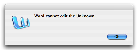
The fact is that as humans we will always make mistakes; ‘to err is to be human’ as the saying goes. The trouble is that most designs are pretty unforgiving when it comes to human error. We’ve all seen harsh error messages blaming us for our stupidity, undecipherable error messages, and error messages which are hidden in obscure places in new technology. It’s the designer’s role to make the user feel confident and in control at all times, not to make them feel stupid.
Unhelpful error message
Helping users recover from errors is important in design. Making them aware of the issue and the steps they could take to overcome them is fairly easy with just a bit of thought and anticipation. What is much more difficult, but much more important, is to avoid human error in the first place.
Some time ago it was my job to help avoid human error from occurring in air traffic control. I worked in a team whose sole responsibility it was to spot potential human errors and avoid them through design and procedures. We also looked at errors that had been made and interviewed air traffic controllers to understand how the error occurred and what we could do to fix it. Although designers may not always have that opportunity, the philosophy of that approach is fairly simple: Any human error could be avoided through good design.
Petrol pumps all look similar
Let’s take a couple of examples.
A fairly familiar mistake to some is accidentally putting diesel in a petrol run car. Anyone who’s ever done this will know that this is not good for your car! What can be done about that error? Well you could label all the people who do this as merely stupid, and not do anything. Or you could have a bit more compassion for people who are tired, stressed, with lots of things on their mind, who might have accidentally chosen the wrong coloured nozzle at the petrol pump and design errors out of the system.
When you accept that design can help remove the error in the first place, plenty of solutions reveal themselves; different shaped nozzles for petrol and diesel that only fit in the right car, redesigned petrol forecourts to separate diesel from petrol cars and so on. Of course the only thing is many of these are quite costly solutions with some practical issues.

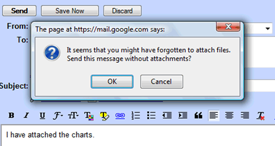
Google’s clever error avoidance pop-up
The great thing about software, apps and websites is that small design changes can be implemented relatively quickly. How many times have you sent an email without an attachment, only to receive emails back asking ‘where’s the attachment dumbass?’ Well, thankfully Google took the steps to tackle the problem by alerting users before the email is sent that they had mentioned ‘attach’ in the text but hadn’t actually attached a file. It’s a wonderful example of spotting human error and avoiding it from happening.
We can never stop humans from making mistakes, and some mistakes contain fantastic learning opportunities for us. But there are plenty of small mistakes people make when using your website, app, or software that could be avoided. Let’s empower our users and make them feel great using your service, rather than make them feel stupid. All you need to do is take the time to anticipate potential errors, help users recover from them, and best of all help them to avoid errors completely.
How could better design have avoided errors you’ve made recently?


