Online fashion retailer ASOS has been in the news once again for another year of soaring success and at a time when other retailers are reporting another quarter of ‘difficult trading conditions’. Rob Bready, Product and Trading Director at ASOS attributed the success to the user experience of the website (and the free delivery)….
“It is very simple – the site is beautiful, easy to use and delivery is free”
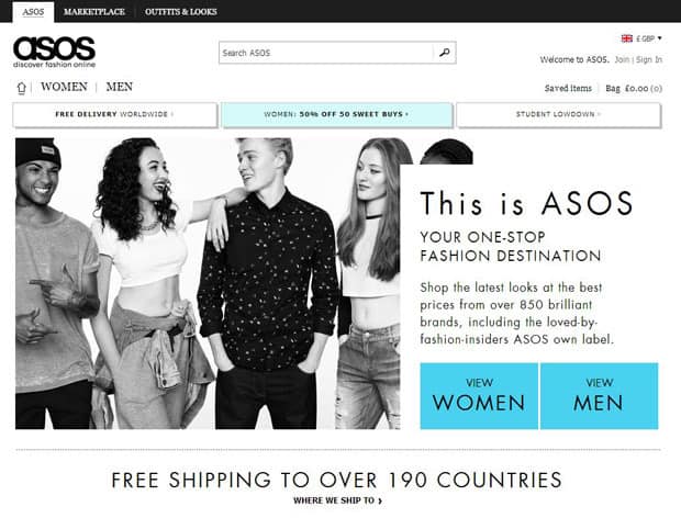
So this got us thinking. What is it exactly that makes Asos.com so easy to use? What can other online retailers learn from them that could help improve the user experience of their website and lead to better online conversions?
We put together the top 10 things that online retailers can learn from Asos
1. Allow users to find your products easily
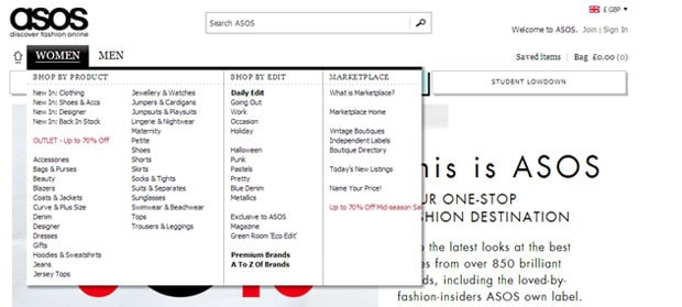
It sounds so simple, yet during usability testing we have conducted on ecommerce websites we have seen users struggle to find the products they are looking for. Asos have over 60,000 product lines on their website, yet you can find any product on the website within seconds. How have they achieved this? Well they use a simple primary navigation which separates the audiences in two core groups ‘Women’ and ‘Men’ and then use a mouse rollover on the mega dropdown to clearly show all the product categories. With one click from the homepage you are into the list of products.
2. Provide an effective search
Apart from the navigation, ASOS use a simple but extremely powerful search, displayed prominently in the header. The search includes a type ahead functionality which directs users to the product categories available therefore reducing the chance of no results found. It also cleverly shows the number of products within each category.

3. Use a decent faceted search
On product listing pages, ASOS use a faceted search to refine products. This means that users are able to browse information by choosing from pre-determined categories. Rather than displaying long lists of facets or checkboxes down a page, they use inline frames with an obvious scrollbar to indicate that more options are available and reducing the length of the faceted search.

The checkboxes are also consistent on the page as you filter which means users don’t need to continue to drill down to find the products they need. They grey out the options that do not apply which improves the scannability of the list. The best feature of all is that the products are refined on the page without the need for a full page refresh. This makes this refining tool more powerful and a lot quicker than standard solutions.
4. Choose a listing layout that suits your products
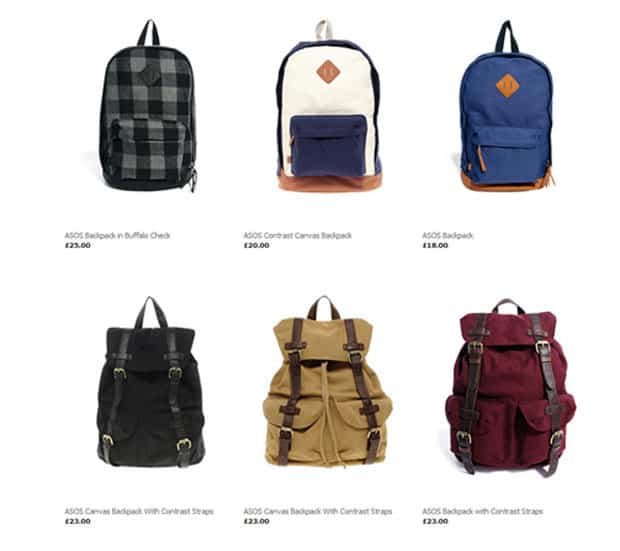
To keep the lists of products simple and free from any distractions, ASOS only show the product image, the product name and price at this top level. This works well for Asos as the look of the product is the most important feature on the page. This grid layout approach works well for products where the aesthetics are key deciding factor in the purchase. Fashion retailers, estate agents, hotels and online shops selling gifts should follow this layout. If your online shop focusses on products where the image is less important but the product details and specifications are the key deciding feature then a list layout might be better for you.
5. Invest in quality imagery
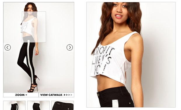
This one is a no brainer but time and time again, we have user tested retailers’ websites with substandard images (or no images at all) on the product pages and this is a big barrier for users. Regardless of the product you sell, users want to see the product. In a traditional bricks and mortar store, shoppers can see all the products in the store. They can feel its weight, assess the quality and read the label easily. Online, all users can rely on is the product image and this image is therefore crucial to converting customers. ASOS understand the importance of this and have invested heavily in technology that tries to imitate a traditional store and allow users to experience their products.
Several high quality images are a minimum requirement for every product on the ASOS website. Most products have a 360 degree tour and increasingly more include a video catwalk.
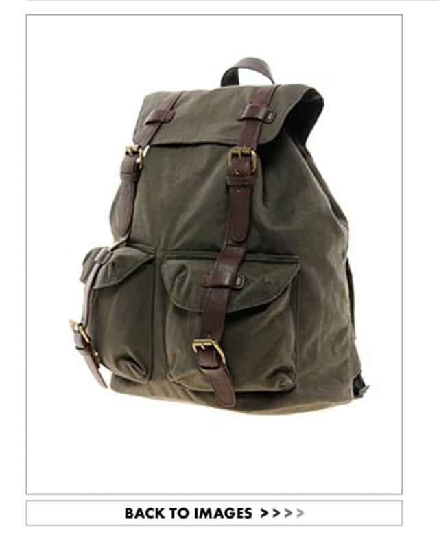
6. Provide confirmation that an item has been added to basket
Your online shop probably already offers some kind of message to tell the user they have added an item to their basket (if it doesn’t then stop reading now and go fix it!). How that confirmation message is displayed is extremely important. ASOS have an effective, yet subtle way of displaying this validation message. When the user clicks on the ‘Add to bag’ button a drop down appears in the top right corner next to the basket to indicate an item has been added. It is displayed for a few seconds and disappears again. This interaction works well for 3 reasons:
1. The user is alerted that the item has been added to the basket
2. The user is notified to the location of the basket when looking to proceed to checkout
3. The user is not required to click anywhere to proceed with his journey
We recommend investigating the technical feasibility in adding similar functionality to your online shop.
7. Do not force users to register before purchasing
Most ecommerce websites that we test insist on forcing shoppers to register to make a purchase. From the testing that we have conducted recently, people hate the idea of registering before purchasing as one woman told us:

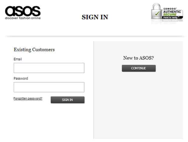
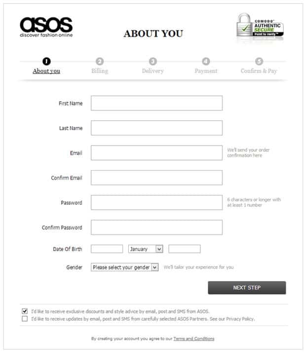
From a user’s perspective we recommend that you do not ask users to register before they make a purchase. But ASOS actually do force all users to register before they make a purchase. But they do it very cleverly.
ASOS, realises that the only two additional fields required between a guest checkout and a registration is the one that asks for a password and another to confirm the password. So rather than advertising the fact that new users need to register on their website and signposting users to the big ‘Register here’ section, they slip in a simple password field halfway down the About you page. When we usability tested this, users didn’t even notice this field and were happily created a password.
8. Provide free delivery and returns
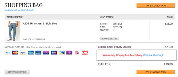
Everyone hates paying for delivery and for many it’s a necessary evil when purchasing online. One of the key USPs of using ASOS is that worldwide delivery is free. We, of course recommend that you offer free delivery on your website but realise that it isn’t always possible. One of the recommendations we often make to our clients is to offer free delivery over a minimum amount, say £30. From our testing, we have seen users continue shopping to reach that minimum amount to ensure that they do not have to pay for delivery. This is a win-win situation as the customer then feels they are getting better value for money with free delivery and you have increased your average basket size. To re-enforce this message, we recommend showing how much extra users need to quality for free delivery on the basket page. This solution has proven to work during testing we have conducted. Below is an example to show how this could work on your basket page.
9. Promote an offer code on your own website
Never underestimate how savvy your shoppers are. One of the most common behaviours we have seen users doing when shopping online is finding a product they like on your website and then going off to another website to find a promo code to use back on your website. This increases the risk they find a promo code on a competitor’s website and never return
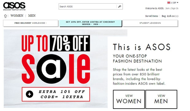
How does ASOS ensure users feel they are getting value for money and not leave the website to look for a promo code? They just give their customers the promotional code in the first place to redeem at the checkout process. Genius!
10. Don’t add unnecessary barriers in the checkout process
Once users are in the checkout process you need to do everything possible to ensure they convert. If you are suffering from users abandoning the checkout process, you really need to investigate this. Imagine if you had a large percentage of your customers leaving the queue at the till in your bricks and mortar store, you would be really concerned. The same is true for your online shop.
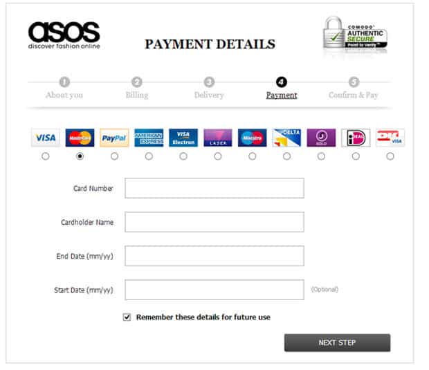
ASOS has done everything possible to remove any barriers and distractions in their checkout process. Their forms are seamless, free of clutter and make good use of white space to remove any complexity and possible confusion. Compare your checkout process with ASOS’s and see how your website fares.
Summary
ASOS has received huge success with their website by focussing on the user and their requirements. We believe by following as many of these examples as possible, you will receive an increase in conversions on your website.
Is there anything that we have missed and should have included when reviewing ASOS? Anything you really love about the website? Or perhaps hate? Are there any other websites that offer better ideas? We would love to know your thoughts so leave your comments below.
We can help boost your conversions
Do you need help increasing your online revenue and conversions? Get in touch for a free informal chat with one of our ecommerce experts.

