I’m totally new to online grocery shopping. I’ve been curious before but I’ve never really seen the benefit for me over just going to the store. I do hate the shopping experience on a busy Saturday, but I prefer to make informed choices about the food I buy rather than relying on a spotty teenager who might choose the bruised apples, or the mince that looks a funny shade of brown. But, this weekend I have a clear need to use an online service. I’m really not sure what the experience will be like so I thought it would be an interesting experiment in customer experience to record my thoughts as I go through the process.
Before I start, I’ll outline my goals and expectations.
My main goal is to get some groceries for the weekend sent to me as I’m without a car and I’m busy all day Saturday. My sub-goals are:
- to see if this is a more convenient way for me to shop in the future
- to save me the hassle of using a bus or a taxi to go to the supermarket and back again
- I want delivery either today (Friday) or Sunday
My expectations:
- to be able to choose the specific items and brands I want
- to be able to choose products from a range of dates available so I don’t have 2 dinners to be eaten within 1 day
- to have to log in with my details
- to be able to choose specific delivery times
- to be able to order items for same day or Sunday delivery
I don’t feel I’m being too unreasonable with my goals and expectations, so lets take a look and see if the site delivers.
I’m going to use Tesco’s website because thats where I do most of my shopping.
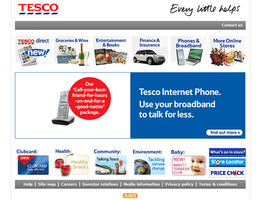
When I hit the tesco.com homepage, the first place I focus on is the Groceries & Wine area which suggests that Tesco have optimised this page for what I assume is their most valuable customer journey. The top left area of the page is where I looked first and where eye tracking studies seem to suggest is a key area for users to focus.
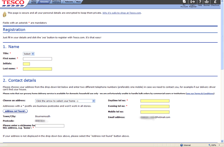
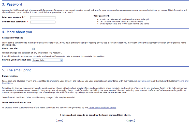
I’m then lead through a couple of clear decision making steps to choose grocery over wine, and I’m a returning user or a new user needing to register. All is well so far. Next I arrive at a page which looses the finesse and clear layout I was used to and instead I’m faced with a large scary looking registration form. Of course I’m expecting one, but the clean layout and the well sign posted decisions to get me here had set up my expectation that it was going to be a smooth process, instead I’m faced with a large form with lots of information to read. I wonder what the drop out rates are like in the traffic stats at this point as my first thought is that maybe I should just get a lift from someone to the store instead.
I carry on anyway and find that the form isn’t anywhere near as scary as it looks and once complete I’m told to check my email to continue. I go to Hotmail and find a fairly pleasant email giving me login details. Unfortunately though, the email misses a small but vital element for me to continue my journey: there’s no link back to the site for me to jump straight to where I was in the process. Instead I have to find the Tesco site again and navigate back to the login page. OK, no massive big deal but not exactly giving me a smooth journey to reach my goal either.
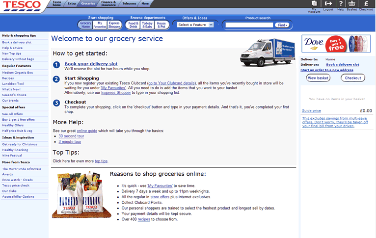
I go back to tesco.com, click on groceries and am pleasantly surprised to find I’m already logged in and can immediately find out when I can get my groceries delivered.
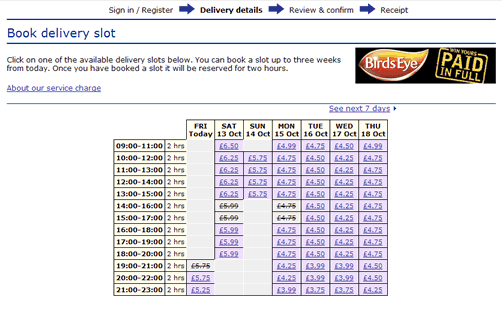
The delivery slot page surprises and disappoints me all at once. I’m happy to see I can get a delivery tonight, but I’m really disappointed to find that I have to pay a fair amount of money to get it delivered. At this point I feel pretty stupid for not expecting to pay this much for delivery, but as it wasn’t what I expected I’m now questioning if I want to continue. The other thing I notice is that Tesco are selling advertising space on their online shop. When I think about it I guess I’m not that surprised, but it goes against my expectations and contributes even more to my disappointment.
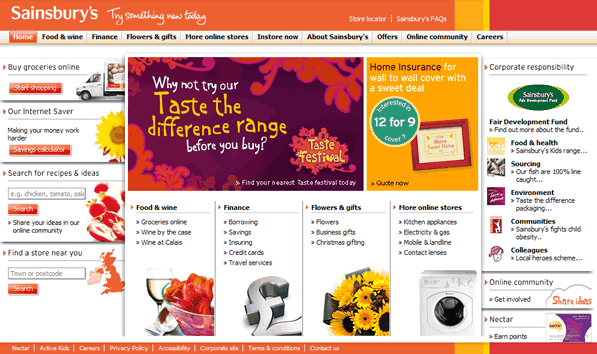
Feeling a bit despondent I decide to take a look at Sainsbury’s to see if they will charge the same amount for delivery. Before going through the registration process I want to find out straight away what the delivery cost will be and if I can get it delivered today or Sunday.
Continuing to prove the ‘top left’ theory, the first thing I spot is the ‘buy groceries online’.
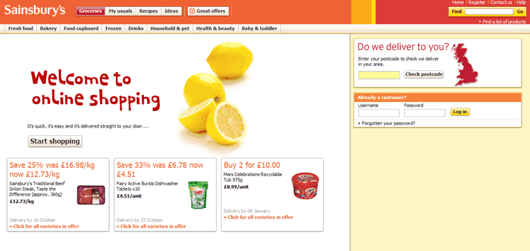
Straight away the site feels more friendly and I get a sense of confidence that this site can help me out when I see that I can check whether they deliver to my area. I just hope they can tell me how much and when.
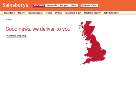
Once again, I’m feeling disappointed and like I’m really going to have to work to find this information. Of course its nice to get confirmation that I can use the service, but what I really want is more information on delivery dates and costs. Where to now? There’s no further information on this page apart from a link to continue shopping which doesn’t help me reach my goal.
As the website doesn’t appear to be helping me I decide to find a phone number and call them instead. Clicking on ‘contact us’ gives me a number. All the options presented to me in the automated system seem to assume that I already have an account, so I choose to ‘hold if you have any other reason to call’. The lady on the other end asks me for my account number or order number and seems a little unnerved that I have neither. So instead she asks for my name and postcode and whether I’m the account holder. I politely explain I don’t have an account yet so she assumes I’m having registration problems. Once we get past all her assumptions I get a chance to explain that before I register I want to know more about likely delivery costs. I’m told that they are between £5 or £6 depending on the store and there is a minimum order value of £25.
At last I can make an informed decision. Seeing as I only need a couple of things for the weekend, and £6 seems an expensive delivery charge to me I decide to look for an alternative way to get to the store which is something I considered right at the beginning.
30 minutes later I’m left slightly aggravated and I still haven’t achieved my main goal.
If I was given the delivery cost, minimum order, and likelihood of receiving a delivery when I needed it on either website I would have had a good customer experience with them despite converting to an online customer. A positive customer experience with either Tesco or Sainsbury’s in combination with the knowledge of the delivery process is more likely to lead me to converting to an online customer in the future. Instead I’m left with the feeling that online grocery shopping is simply too much hassle.
A summary of usability and customer experience learning points for online grocery retailers:
- clearly signposted decision making tools leading customers through their initial journey is likely to build confidence in the service
- the registration process should be clean and free of unnecessary copy
- every step in the registration process, particularly steps which lead customers away from the site (i.e. confirmation email) should be focused upon guiding customers to completing their goals with links back to the next stage in the process
- deliver information on likely costs, availability and minimum order conditions should be made available clearly at the very beginning of the customer journey
- customer profiles detailing likely customer goals, and mapping out customer journeys should be used by online grocery retailers to ensure their website and call centre staff don’t create unnecessary barriers though false assumptions assumptions which lead to barriers
- If Tesco and Sainsbury’s had generated customer profiles and mapped out possible customer journeys to reaching likely goals, maybe they would have anticipated my goal and ensured the website and call centre staff could assist me in achieving it as quickly and easily as possible
Does your website or call centre help your customers achieve their goals quickly and easily?
Just as I was about to post this, I found an article suggesting that over 70% of consumers have not used online grocery shopping before. Judging by my brief dabble here, I can’t say I’m surprised.
