Our #LearningPoints Slack channel is a hive of reflections and takeaways that we review as a team each week. It can be cathartic, funny, painful and informative! As a team, we continually challenge and encourage one another to reflect on our work and share key takeaways (or leave-behinds) from our daily activities.
These learnings, shared in our weekly meetings, are often discussed and reviewed, with the ultimate goal of doing more of what works, and to improve the quality and impact of our research. It’s been a busy start to 2022, and my notebook is now brimming with insight! Taking stock of the last 12 months, I wanted to share a few of our process takeaways with you.
Tools for next-level scheduling
In these past few months, we have had the opportunity to work on some fantastic multifaceted projects. These projects often require the involvement of our whole team as well external colleagues, which takes some ‘next-level’ planning. Whilst we have thoroughly enjoyed this time together, we have certainly felt the strain when it comes to aligning our calendars and getting activities booked in, sometimes this has come at the cost of some of our lunch breaks!
‘Starting with the end in mind’, as our Head of UX Jenny would say, we plan our projects working backwards from delivery deadlines to scope who is needed when.
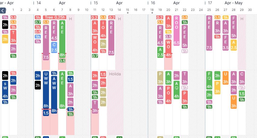
Float is the tool we use to visualise our weeks and ascertain who is working on what project, weeks and months in advance. It’s a throwback to days gone by when the team would have a whiteboard tracking forthcoming activity. Instead of Gantt chart level detail, which we sometimes use in addition, Float is used to provide us all with an overview, to see which resource is working on which project at any given time.
Float has been incredibly helpful as we establish the project deadline and then reverse engineer our schedule to ensure we can get everything delivered on time, and we can communicate this clearly with our external resources and our client teams. A win-win for everyone!
Rethinking remote research notetaking
Throughout our remote project work, we observe and capture findings using our go-to tool, Miro. Oftentimes, we find ourselves pining for the pre-pandemic days of in-person observation, utilising whiteboards and post-it notes, and we expect to incorporate more of that working in time.
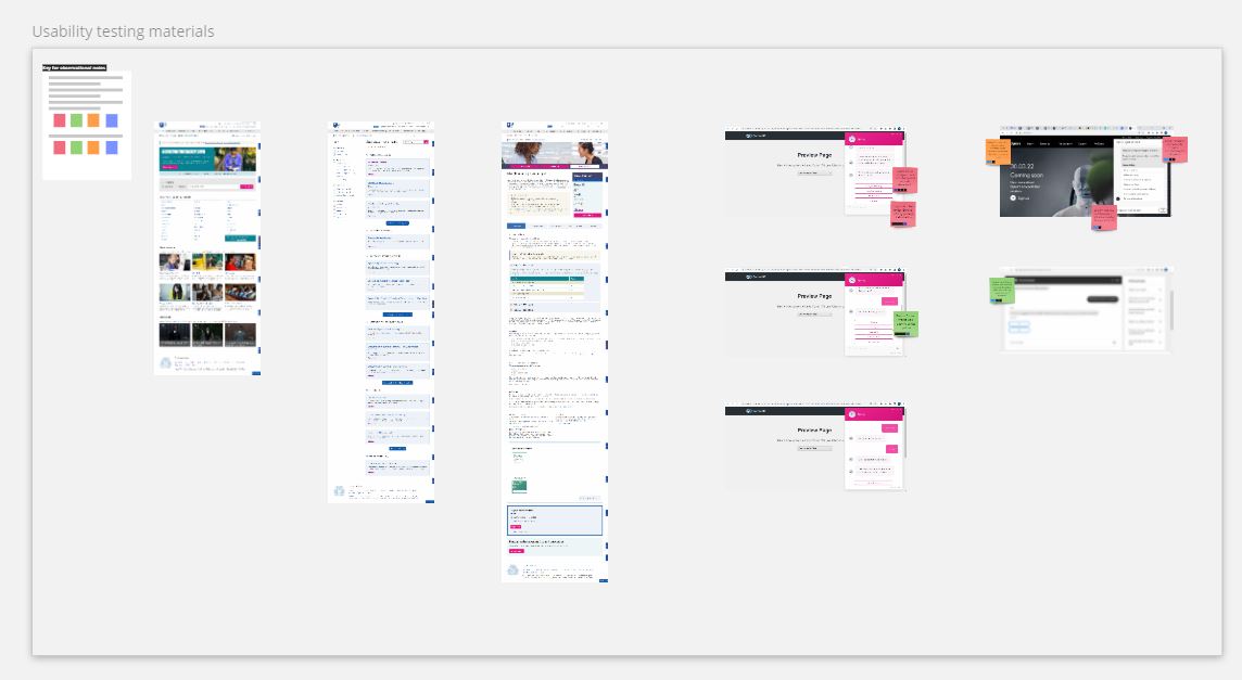
Prior to lockdown we already had a remote note-taking Miro template that we had created for previous projects. Remote testing was few and far between for us then – but moving everything over to remote, we naturally picked up these templates to use on all research projects. The template, using swim lanes to denote each new research participant and columns to cater to research objectives and questions, has been successful and clients have also enjoyed getting involved, but it is a very different format to our in-person note-taking.
We found that notes were always plentiful – way too many, and covering everything, whether relevant to the project objectives or not. This was creating more effort in the analysis phase. We have therefore been challenged to rethink how we note take during research observation, inspired by the good-ol’ days of in-person observation.
Miro is a tool we have come to use, not only to plan research but to note take, analyse and sometimes even deliver research output. With a world of endless possibilities on Miro, we have had to reassess our processes and how we use this tool. With regards to note-taking, we needed to streamline, to ensure we focus our research notes on the detail we need for the project at hand.
We revised the note-taking template to focus on screenshots first, and to utilise Miro tagging to mark which post-it relates to which participant. We use colours; Green is a positive note, Pink is a not so positive note, Blue is for a useful quote, and Orange is for an idea. There is still a place for all additional notes, but they are away from the screenshots.
Through the use of the post-it notes and tagging in the context of the screenshots, we can analyse the insights more effectively, making more time for creativity and innovation. It is interesting to note how we just went with an existing template because we already had it, even though it didn’t align fully with our in-person process.
Project Retros
Upon completion of recent research projects with multiple phases and methods, we often come away with a sense of achievement combined with a head full of thoughts and learnings, which can be difficult to digest. Much like this article, we like to reflect on our projects to understand what worked well and what can be improved in the future.
At the end of a project, it is all too easy to switch to the next project without pausing to consider our learnings. Inspired by a multi-agency project we worked on, we now include a Retrospective (Retro) at the end of each project, a time for us to look back and assess the trials and successes of a project.
Booking this time for the project team to sit down and collate our thoughts about how a project has gone, we like to go through each phase of the project to pick out the things that we would like to continue to do in the future or avoid, and what we will do differently next time. This can be an invigorating and relieving process which can help get the stuff out of your head and onto paper.
What we realise is most important here is to ensure the time is scheduled as part of a project, and then to action the learning points for continued improvement.
Next change?
With projects often back to back, we are on a journey to demark space to pause, breathe and reflect. This will benefit our team and our projects. If we don’t take the time to incorporate reflection into our projects, we are not delivering fully on the promise of considered and creative UX, and we would fail to learn from our work and develop as a team. Indeed, as we move into June, as requested by our Head of UX, we are introducing a day (Friday) per week of non-project working. I will keep you posted and will report back on our learnings and successes from this new endeavour!


