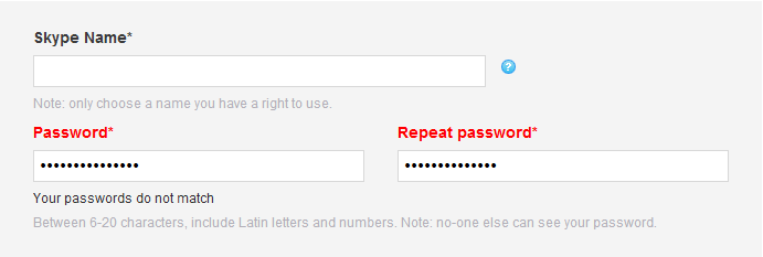
One of our clients is in the process of re-designing the registration process on their ecommerce website. She got in touch and asked our thoughts on whether she really needed to mask users’ input in the password field and display a repeat password field. This is a fairly common approach you’re probably already familiar with. Here’s an example of Skype’s registration using this approach:

Her doubt arose after reading Jakob Nielsens’s Alertbox from June 2009 titled ‘Stop Password Masking’ which argues that usability suffers when users can only see a row of bullets in the password field and since there is “usually” nobody looking over their shoulder, security is not a good trade-off for poor usability .
Now, although we agree with Mr Nielsen that masking passwords can create usability issues (especially when entering long and complicated passwords), we feel that security is an important issue and with the massive growth of accessing websites on mobile devices in public places, it wasn’t something we could just dismiss.
So what’s the solution to password masking?
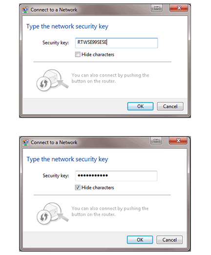
Users will always need an option to enter a password securely when there are other people nearby so we did some digging around and found Microsoft Windows 7 has a great solution to this problem. They found a good balance between security and usability.
The password input field is presented unmasked by default meaning users receive the visual feedback they require yet they have the control to enter the password more securely by selecting the checkbox to hide the characters.

This solution not only gives users the choice to decide on the level of security they require but also removes the need for a confirm password field so the risk of user errors is reduced. Our client is now redesigning the registration process with a single password field with a checkbox to toggle visibility of the characters.

