There is something about hand drawn paper wireframes that I have always liked. The sketchy lines and hand drawn icons always help me to see the wireframe as one possible idea rather than a final solution.

Don’t get me wrong, I like presenting the slick high fidelity html prototypes to clients in the final stages of the UX project but early on when ideas are forming and the possibilities are endless, sketchy paper wireframes always add an element of excitement.
However, as much as I like hand drawn wireframes, for me sketching on a pad of paper is extremely difficult and time consuming. As much as I try, I struggle to create realistic looking wireframes and am constantly starting again and again until I give up in frustration.
Most wireframes look ‘final’ when they are still just concepts
On a recent project for a well-known charity, I needed to present a series of rough concept ideas to participants in focus groups to see which ideas they engage with. I wanted to get honest thoughts and feelings and I was worried that anything looking too ‘polished’ would make the work look finished, so I felt the only option was to present them with sketchy looking wireframes so they can see the work was still in progress.
How to create sketched style in Axure
Finding the sketch effects functionality in Axure 6.0 was a nice surprise and seemed to give me the possibility of the best of both worlds – sketchy hand drawn wireframes but with the ease and speed of using specialist software.
This functionality sits neatly at the bottom of the interface alongside ‘page notes’ and ‘page interactions’ and allows you to quickly alter clean straight-lined wireframes into the sketchy hand drawn look and feel that I was after.

The sketch options available in Axure
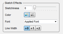
Although the functionality is still quite limited here (only 4 main controls), they still offer enough to make them work.
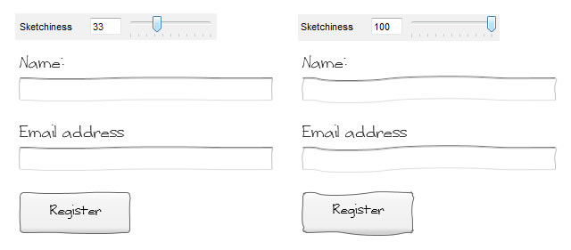
Sketchiness – Playing with this functionality shows you just how sketchy the wireframe can be. This ranges from the standard straight lines seen on usual wireframes to wavy lines that looked like they have been drawn by a child. I found that a sketchiness of 33 out of 100 seems to provide the most realistic to hand drawn wireframes.

The sketchiness slider at work
Colour – Selecting whether the wireframes should be colour or black and white is fairly straight forward. One nice feature here is that all images in the wireframe are converted to grey scale saving you having to edit the images first.
Font – The best font to use was probably the hardest challenge. Most standard fonts seem to clash with the sketchy lines and made the wireframe look too polished. After comparing many different styles I settled on a free font called ‘Writing Stuff’ (www.dafont.com/writing-stuff.font). I felt that it was the closest to natural handwriting, however, a point to remember is most computers do not have this font installed as standard so if presenting a prototype on another computer, you need to make sure that they have the fonts installed too. [Update – Axure got in touch to let us know that it is possible to convert text into images allowing anyone to see the font by following this path in the menus: Generate > Prototype > Advanced >Render Txt as Img]

Without a handwritten font the sketch effect doesn’t work
Line Width – The line width allows you to change how wide all the lines are throughout the prototype. I didn’t really see the need for this functionality so kept it at +0.
To make the wireframes feel even more realistic and to get the concepts across better, I wanted to use hand drawn icons on each concept. There are many free sketchy style icons available but not all offered what I was looking for. To ensure all the icons were consistent in style on all concepts, I decided to pay for a full set icons from www.webiconset.com. For $25, you get 120 common web icons in the sketchy font at the usual sizes. This small investment was worthwhile as communicated the ideas better and greatly added to the rough look and feel of the wireframes that I was after.
![]()
The hand drawn icons we used
Sketched wireframes get more honest user feedback
Axure sketchy wireframes are a much quicker and easier solution which still creates the illusion that wireframes are still in their infancy but allows you to create them quickly and easily, and the flexibility make changes and amends without starting each page again. These wireframes will never fully replace the creative hand drawn wireframes but during the focus groups, I felt participants were more inclined to critique the rough concepts more objectively than if I had just presented a standard straight-lined wireframe. This gave me a lot more positive and negative feedback I was after. The only downside was that when I was using the sketchy font, I had problems when showing the wireframes to other people over the internet.

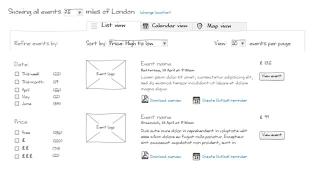
An example of the end result

